Why Your Bar Graphs Probably Aren't Working
Let's be honest, how many bar graphs have you seen that actually made an impact? I've sat through countless presentations where charts just get glossed over. The data might be good, but the presentation falls flat. It's a common problem, and it's not about the numbers themselves; it's about how you connect with your audience.
Imagine a simple bar graph showing sales figures. Just displaying the raw numbers isn't very engaging. Now, compare that to a graph showing how those sales stack up against the competition, or how they've grown over the last year. Suddenly, the data has context and meaning. That's the magic of visual storytelling.
Think about it: bar graph makers like Microsoft Excel or Google Sheets are everywhere. By 2022, over 60% of business presentations included some type of bar graph or chart. With so many charts floating around, yours needs to be special to stand out. Check out some examples of effective market share bar graphs: https://www.visme.co/templates/charts/market-share-bar-graph-1425284581/
So, how do you cut through the clutter? It all comes down to understanding how people process visual information. We're naturally drawn to visuals that are clear, concise, and tell a story.
Your bar graph shouldn't just present data; it should narrate a compelling story. I've seen presentations where strong visuals helped secure funding, and others where poorly designed charts led to missed opportunities. Through real-world examples, we'll explore the psychology behind effective data visualization and turn your bar graphs from ignored slides into powerful communication tools that people actually want to see.
Finding Your Perfect Bar Graph Maker Match
So, you're looking to create some eye-catching bar graphs? Great! But choosing the right tool can feel a bit like searching for a needle in a haystack. There are tons of bar graph makers out there, and finding the perfect one depends on what you're trying to achieve. It's a bit like choosing the right kitchen knife - a paring knife isn't much use when you need to carve a roast.
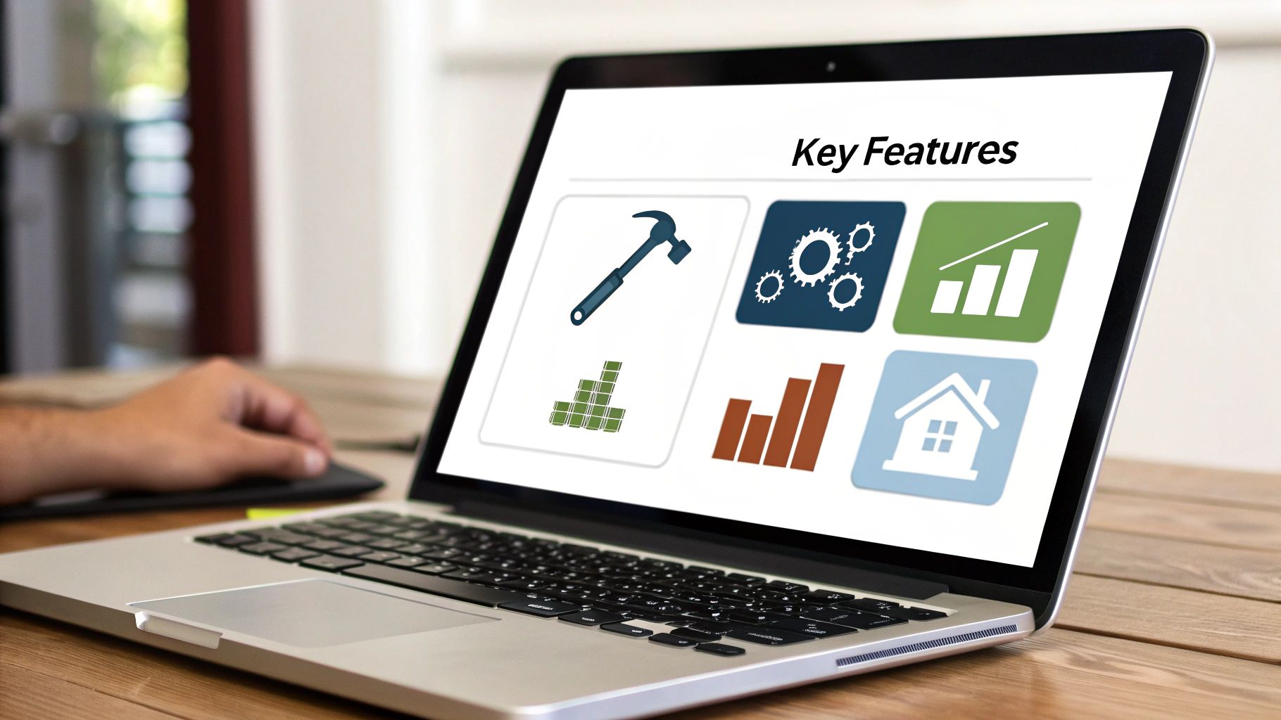
Take a look at the Canva interface above. It's super intuitive, right? That's a key feature of many modern graph makers. Platforms like Visme, Canva, and TabLab have made it surprisingly easy for anyone to create professional-looking charts, even without a design background. It's no wonder these platforms are so popular. Canva alone boasts over 75 million monthly active users! Many of them are using its graph-making capabilities. For some cool market share bar graph templates, check out this link: Market Share Bar Graph Templates.
Choosing the Right Tool for the Job
The best bar graph maker for you will depend on your specific needs. If you're a freelance consultant, a simple and free tool like Google Sheets might be all you need. But if you're part of a marketing team, you might need the collaborative features and advanced design flexibility of a platform like Canva.
The size and complexity of your data also matter. A small dataset is easy to manage in most tools, but larger, more complex datasets require a bar graph maker that can handle the volume.
And don't forget about sharing! Where will your graphs end up? Presentations? Reports? Social media? Some tools are better suited for specific output formats. For more content creation tips, check out this blog: TNote Blog.
Thinking Long Term
One thing I've learned is that seemingly minor annoyances, like a clunky interface or limited export options, can become major frustrations over time. So, take advantage of free trials and read reviews before committing to a platform. Don't be afraid to switch if a tool isn't working for you.
To help you make the best decision, I've put together a comparison table of some popular bar graph makers:
Bar Graph Maker Platform Comparison Real-world comparison of leading platforms based on user experience, pricing, and practical capabilities for different use cases.
| Platform | Best For | Learning Curve | Collaboration Features | Starting Price |
|---|---|---|---|---|
| Canva | Individuals, small businesses, social media graphics | Easy | Robust real-time collaboration | Free (with paid options) |
| Visme | Businesses, marketers, presentations | Easy to Medium | Team collaboration features available | Free (with paid options) |
| Google Sheets | Simple graphs, data analysis, quick charts | Easy | Real-time collaboration | Free |
| TabLab | Data journalists, complex datasets | Medium to Advanced | Limited collaboration | Varies based on usage |
As you can see, each platform has its strengths and weaknesses. Canva excels at ease of use and collaboration, while TabLab is better suited for more complex datasets and data visualization. Google Sheets is a great free option for simple graphs, and Visme offers a good balance of features for business users.
Your perfect bar graph maker is out there. Take the time to explore your options and choose the one that best fits your workflow and helps bring your data to life!
Creating Charts That Tell Your Story
Forget dry tutorials, let's talk about breathing life into your data with compelling bar graphs. I've seen firsthand how the right design choices can transform a jumbled mess of data into a clear, insightful story. It's like the difference between a bland PowerPoint presentation and a captivating TED Talk – both might contain the same information, but one truly resonates.

For example, I once wrestled with a project visualizing website traffic. The initial bar graph, while accurate, was about as exciting as watching paint dry. By tweaking the color palette to emphasize key metrics and adding clear labels, the graph suddenly popped. It went from a wall of numbers to a clear narrative about user engagement. The client was ecstatic – proof that good design truly makes a difference.
Design Decisions That Matter
Crafting effective bar graphs with a bar graph maker isn't just about inputting data; it's about making conscious design choices that amplify your message. Consider your audience, the chart's purpose, and where it'll be displayed. These seemingly small decisions can have a huge impact.
To help you navigate these choices, I've put together a handy framework:
Chart Design Decision Framework: Practical guidelines for making design choices that enhance rather than hinder your data story
| Design Element | When to Use | Common Pitfalls | Impact on Message |
|---|---|---|---|
| Color | To highlight key data points or create visual groupings. | Using too many colors or colors that clash. Ignoring colorblind accessibility. | Can draw attention to important information or create a sense of order. Poor color choices can confuse the audience. |
| Spacing | To improve readability and avoid a cluttered look. | Cramming too much information into a small space, making it difficult to decipher. | Gives the data "room to breathe" and makes it easier to understand. Poor spacing makes the chart look overwhelming. |
| Typography | To complement the overall design and ensure legibility. | Using overly decorative or illegible fonts. | Contributes to a professional and polished look. Poor typography can make the chart look amateurish or difficult to read. |
This framework helps you approach design strategically, ensuring every element works in harmony to tell your data story. By understanding the "why" behind each choice, you'll create bar graphs that truly resonate.
You can find even more tips on visualizing your data with TNote Stats. It’s a great resource for taking your data visualization to the next level.
Handling Tricky Data
Sometimes, data throws you a curveball. You might encounter tricky situations like vastly different data ranges or negative values. Don't worry – I’ve been there! Here are a few tips from the trenches:
- Vastly Different Data Ranges: A logarithmic scale or a broken y-axis can be a lifesaver. This prevents smaller values from getting lost in the shadows of larger ones.
- Negative Values: Use distinct colors or patterns to clearly differentiate negative from positive values. This prevents misinterpretations and ensures clarity.
- Mobile Optimization: Think about how your graph will look on a smaller screen. Adjust font sizes and spacing as needed. A stunning desktop graph can quickly become unreadable on a phone.
By anticipating these challenges, you'll create bar graphs that are both visually appealing and informative, no matter how complex the data. Remember, the goal is to tell a story, not just present numbers. Let your data shine!
Advanced Techniques That Set Your Charts Apart
Want to transform your bar graphs from simple to stunning? Let's explore some advanced techniques that can truly elevate your data visualizations. Think of it like this: your basic bar chart is a solid foundation, but these techniques are the design choices that make it shine.
Grouped and Stacked Bar Charts: Telling a Richer Story
A standard bar chart works well for single data points. But what happens when you need to compare multiple categories at once? That's where grouped and stacked bar charts enter the picture. Grouped bar charts place related data points side-by-side, making cross-category comparisons a breeze. Stacked bar charts, conversely, visualize the cumulative total of various subcategories within a single bar.
For example, imagine you're analyzing website traffic data. A grouped bar chart could compare traffic from different sources (like organic search, social media, and referrals) for each month. A stacked bar chart could then break down each source further, showing the proportion of mobile versus desktop traffic within each month.
Strategic Annotations: Guiding Your Audience
Annotations, such as callouts and labels, act as a guide for your audience, highlighting key data points without overwhelming them with excessive text. A strategically placed annotation can explain a sudden spike or dip, or emphasize an important trend. In my experience, even simple arrows and labels can dramatically improve a chart's readability.
I remember using a bar graph to present sales data. Adding a simple annotation to explain a mid-year promotion instantly clarified a significant sales jump. That one small addition made the data story much more compelling and persuasive.
Design Details That Matter: Whitespace and Hierarchy
Whitespace is the breathing room in your design. Too much clutter makes a bar graph difficult to understand, just like a cluttered room feels chaotic. Ample whitespace around bars and labels improves readability. Visual hierarchy, achieved through font sizes and color choices, directs the viewer's attention to the most important information first. Mastering a bar graph maker involves understanding these design principles.
Horizontal vs. Vertical: Choosing the Right Orientation
Choosing between horizontal and vertical bars isn't just about aesthetics; it impacts how your data is interpreted. Horizontal bars excel at comparing categories with long names, providing plenty of space for labels. Vertical bars are often more effective for displaying trends over time. I often choose horizontal bars when dealing with categorical data with lengthy descriptions. It's a simple way to maintain readability without sacrificing valuable space.
Emerging Trends: Interactivity and Mobile-First Design
In our mobile-first world, designing charts that adapt to any screen size is essential. Interactive elements, like tooltips that appear on hover, can boost engagement, but should be used sparingly. Too much interactivity can become distracting. The key is finding the right balance between visual appeal and functionality. Ultimately, the goal is to create engaging charts that effectively communicate your data story.
Real Success Stories Across Different Fields
Seeing how others use bar graphs can spark some great ideas. Let's take a peek at how different professionals, from teachers to financial analysts, use these visuals to communicate effectively. Think about it: a teacher showing student performance uses bar graphs very differently than a financial analyst charting market trends. Exploring these differences can be incredibly helpful.
For example, a teacher might use a bar graph maker to visualize student test scores. Color-coding could quickly show which students are exceeding expectations, meeting them, or needing a little extra help. This at-a-glance view makes it easy to identify students who might need some one-on-one attention. This is completely different from, say, a marketing team tracking their campaign performance with bar graphs.
The rise of easy-to-use tools has made data visualization much more accessible. The market for these tools, including bar graph makers, is booming. In fact, the global data visualization market was valued at USD 8.85 billion in 2022 and is projected to grow at a 10.1% CAGR from 2023 to 2030. Discover more insights into the bar graph market. This growth really highlights the increasing importance of visual communication across many industries.
Industry-Specific Considerations
Every industry has its own unique needs when it comes to visualizing data. Healthcare professionals, for instance, need to be extra careful about patient privacy. This might mean anonymizing data or using grouped values instead of individual patient records. Financial analysts also work with sensitive market data and have to carefully consider what they present and how they present it.
Learning From the Pros
I've learned some valuable strategies from talking with experienced data visualizers. One common mistake is creating overly complex charts that confuse the audience. Keeping things simple and clear is often better than a complicated design. Another great tip? Think about where your chart will be seen. A bar graph that looks great on a big screen might be impossible to read on a phone. Adapting your design for different viewing situations is key to making an impact.
Emerging Trends and Mobile-First Audiences
With so many people using mobile devices, charts need to be designed with mobile viewers in mind. Real-time data visualization is another interesting trend. Imagine a dashboard showing live sales figures, updating every minute. That kind of dynamic view provides immediate insights and lets you make quick decisions. Keeping up with industry trends and adapting your approach will keep your bar graphs effective.
Sharing Your Charts With Maximum Impact
So, you've crafted a stunning bar graph. Great work! But creating it is only half the battle. Now, let's talk about getting your visualization seen and making a real impact, whether it's for a presentation, a report, or anything in between.
From Markdown to Shareable Visuals
Here's a little trick I've found super helpful: turn those Markdown bar graphs into eye-catching cards. I use TNote for this. It's an easy way to transform Markdown files into polished, shareable visuals. This "md2card" process is especially useful for social media or embedding graphs in online documents. Honestly, I've seen way more engagement this way compared to just static images.
For instance, let's say you've built a Markdown bar graph tracking project milestones. With TNote, you can quickly convert that simple graph into a visually appealing card, perfect for sharing with your team or stakeholders. It just makes the data more digestible and memorable.
Collaborative Chart Creation
Many of today's bar graph makers offer collaborative features. This isn't just about convenience; it's about streamlining team workflows and making sure everyone's on the same page, especially with so many of us working remotely. The right bar graph maker can be a game-changer for team projects.
Consider version control. We've all been there – "Wait, who made this last edit?" Collaborative platforms solve this. Features like real-time editing and commenting let team members work on the same chart at the same time. This is incredibly helpful for distributed teams, as it keeps everyone in the loop and gives everyone a chance to contribute.
And speaking of collaboration, online bar graph makers have become essential for education and remote teams, particularly since 2020. Platforms like Canva, Moqups, and TabLab saw a 50% jump in user registrations for their charting features during that time. You can find more info on this growing trend here.
Exporting and Future-Proofing Your Charts
Effective sharing also means understanding export formats. Choosing the right one—a high-res PNG for presentations or a scalable SVG for the web, for example—makes sure your visuals look their best, no matter where they're displayed.
Also, think about the long term. Will your graphs still be easily viewed on future devices? Using vector formats like SVG can future-proof your work, keeping your graphs sharp and crisp as technology advances.
Key Takeaways For Your Chart Creation Journey

Let's boil down everything we've talked about into practical advice you can use right away with any bar graph maker. These are the core principles I personally rely on to make sure my charts are effective and not just clutter.
Focus on the Why
Before you even open your bar graph maker, take a second to think: "What's the point of this chart?" Knowing what you want to achieve—maybe it's showing growth, comparing different things, or spotting trends—makes your design choices much clearer. For example, if you're highlighting a sales increase, using bright colors and clear labels on those specific bars really gets the message across.
Clarity Over Complexity
Honestly, the best charts are often the simplest. Don't try to cram every single data point into one visual. It's like trying to explain quantum physics in a tweet. Focus on one key message per chart. Got more to share? Make more charts! This keeps your audience from getting overwhelmed and lets the data speak for itself.
Know Your Audience
Think about it like this: you wouldn't explain something to a five-year-old the same way you would to a college student. Your chart's design should consider who's looking at it. An executive summary needs a different approach than a detailed technical report. What does your audience already know? What do they need to know? How do they best process information? Keep these questions in mind, especially when picking colors, fonts, and labels.
Check Your Charts Against These Metrics
Don't just ask, "Does it look pretty?" Ask, "Does it work?" Does it clearly communicate what you want it to? Is it easy to understand? Does it actually lead to the insight or action you were hoping for? Those are the metrics that matter. A visually stunning chart that doesn't communicate is like a fancy sports car that won't start – all show, no go.
Transform your Markdown notes into compelling visuals with TNote. Turn your data insights into shareable knowledge cards effortlessly. Check out md2card and see the magic.