Think about the last time you were scrolling through a website or your social media feed. What actually made you stop?
Chances are, it was a sharp, eye-catching visual. That’s the magic of good banner graphic design. It’s not just about making something look pretty; it's about creating a powerful communication tool that slices through the digital noise and gets a clear message across in seconds.
In a crowded online space, your banner is often the very first handshake with a potential customer. It’s your visual elevator pitch.
Why Effective Banner Design Matters More Than Ever
Getting this right is a game-changer for anyone trying to get real results online, from marketers to small business owners. The global graphic design industry, which includes all this banner work, was valued at a whopping $45 billion back in 2021 and is only expected to grow.
This isn't just a number; it shows how much businesses are betting on strong visuals. In fact, nearly 60% of small businesses now rely on graphic designers to shape their brand, highlighting just how vital banners are for any promotion. If you're curious, you can explore more graphic design industry stats to see the full picture.
The Dual Role of Banners
A well-crafted banner is doing two critical jobs at once:
- Building Brand Recognition: Consistent colors, fonts, and logos across your banners are what make your brand stick. The goal is simple: when people see your banner, they should instantly know it's you.
- Prompting Immediate Action: The other, equally important job is getting the viewer to do something. This is where a strong call-to-action (CTA) becomes the hero of your design, whether it's a button that says "Shop Now," "Learn More," or "Sign Up."
Banners for Every Platform
Once you nail the fundamentals of banner design, you’ll see how versatile the skill is. The same principles apply across different formats, each with its own specific purpose. You'll find them everywhere:
- Web Banners: These are the classic ads you see plastered across websites—the long "leaderboard" ads at the top of a page or the tall "skyscraper" ads on the side.
- Social Media Ads: These are banners specifically tailored for platforms like Facebook, Instagram, and LinkedIn, designed to fit perfectly into feeds and stories.
- Print Banners: Think big. These are the large-format visuals you see at trade shows, conferences, and inside retail stores, all designed to grab the attention of people walking by.
Ultimately, a truly great banner is a perfect mix of art and science. It marries eye-catching aesthetics with a sharp understanding of marketing goals, making it one of the most valuable assets in your toolkit.
Fundamental Principles of High-Converting Banners
Great banner design isn't about just tossing flashy elements onto a canvas and hoping for the best. It's a calculated craft. To create banners that don’t just get seen but actually get clicked, you need to understand the core principles that guide a viewer’s eye and mind. These concepts are what turn a simple image into a powerful conversion tool.
Think of visual hierarchy as the roadmap for your banner. It tells a person exactly what to look at first, second, and third. A successful hierarchy makes sure your most important message—the killer offer or unique value—is seen first. Supporting details come next, followed by your call-to-action. Without a clear hierarchy, your banner is just a confusing jumble of parts fighting for attention.
Just like a great headline in an article, a big, bold font or a vibrant image will immediately grab the eye. This is the starting point of your viewer's journey.
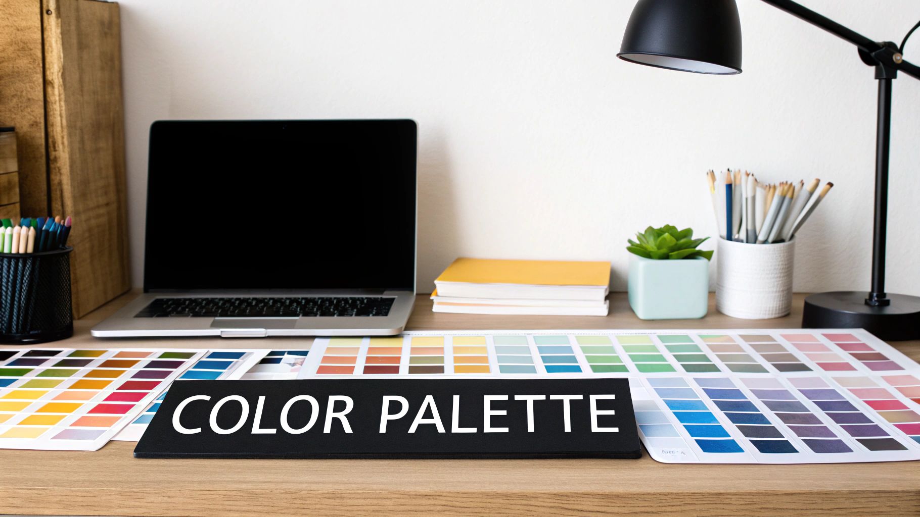
Command Attention with Color and Type
Color is your emotional shortcut. The colors you choose can instantly set a mood or trigger a gut feeling. For example, blues often signal trust and security, which is why you see them so often in the tech and finance industries. On the other hand, fiery reds and oranges create urgency and excitement—perfect for a limited-time sale.
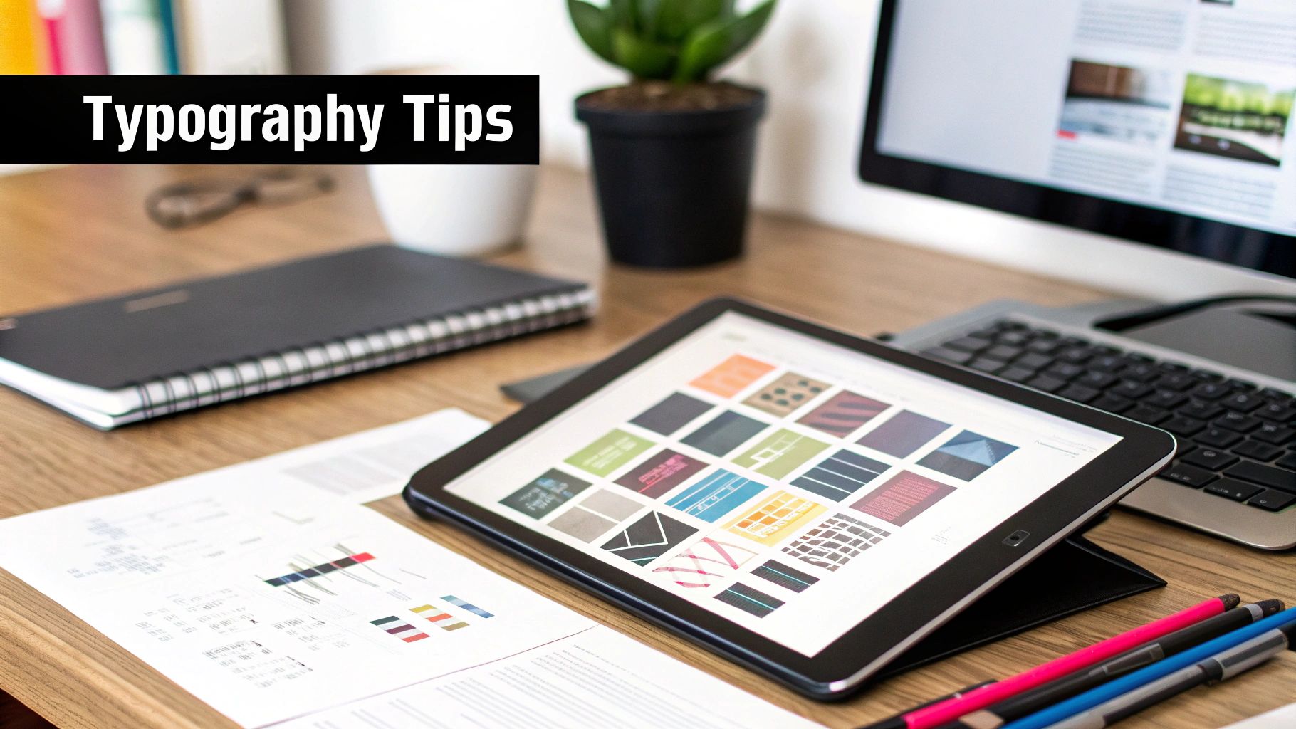
Typography, or the style of your text, is essentially the voice of your banner. Is it bold and modern, or elegant and traditional? Whatever you choose, your font must be instantly legible and match your brand's personality. A classic mistake is picking a font that's super decorative but impossible to read, especially on a small mobile screen.
Here’s a great example showing several common web banner formats and their typical sizes.
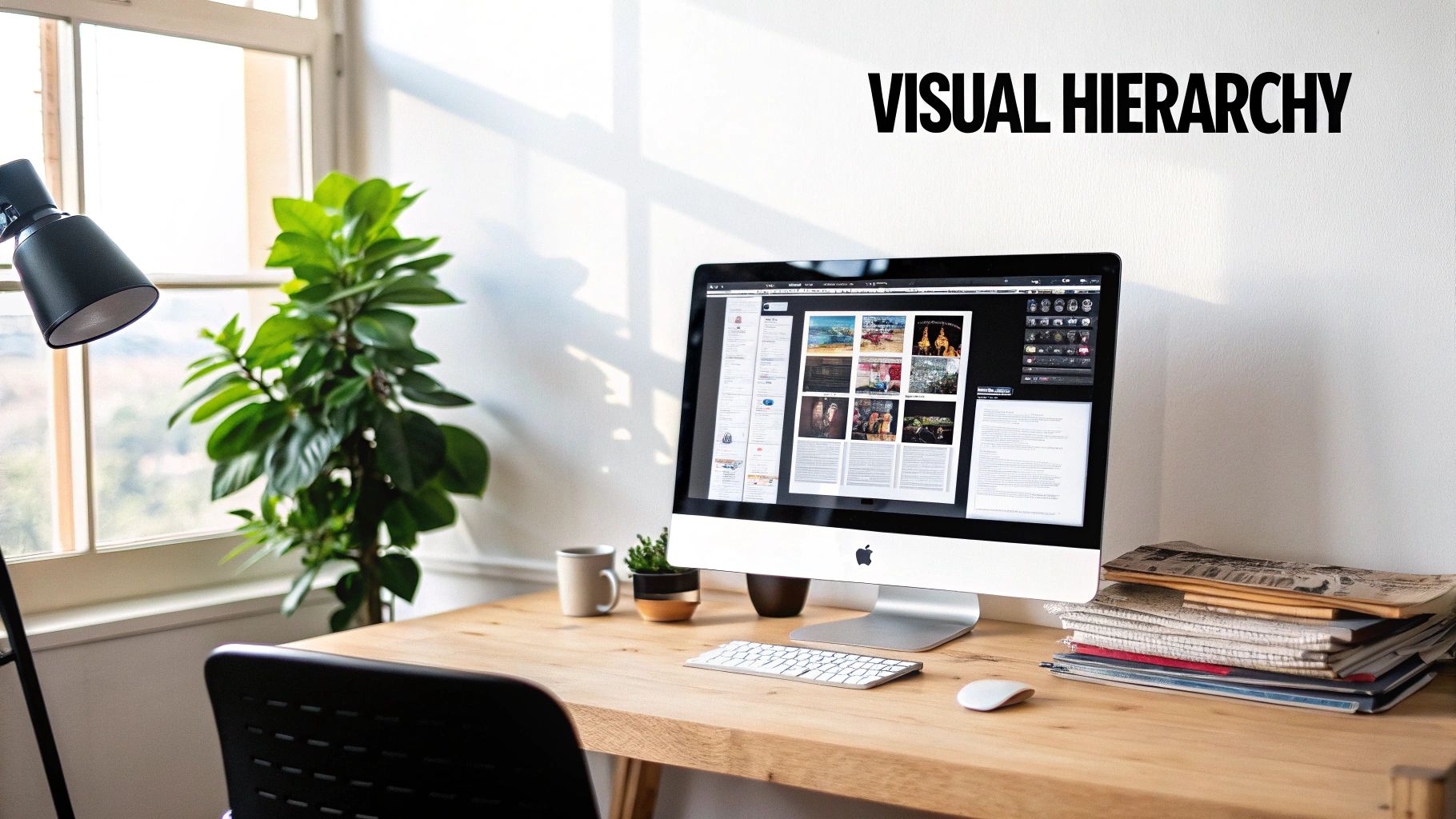
This image really shows how visual hierarchy works across different banner shapes and sizes, from wide leaderboards to tall skyscrapers. Each one guides the eye to a key message.
Unify Your Message with Imagery and a Clear CTA
Compelling imagery tells a story in a split second. A good image should connect with your target audience and hammer home the banner's main point. Steer clear of those generic stock photos that look like they came from anywhere. Instead, pick visuals that show your product in action, highlight a key benefit, or feature people who look like your ideal customers.
Ultimately, every single element—the hierarchy, the colors, the fonts, and the images—must all serve one master: the Call-to-Action (CTA). Your CTA is the banner's entire reason for existing. It has to be clear, concise, and compelling.
A banner with more than one primary call-to-action is like a map with two "You Are Here" stickers—it's confusing and leads nowhere. Your design should funnel all attention toward a single, desired action.
To make sure your CTA stands out and does its job, just follow these simple rules:
- Use Action-Oriented Language: Start with strong verbs like "Get," "Shop," "Download," or "Learn."
- Create Visual Contrast: The CTA button needs to pop. Use a color that stands out against the background, making it impossible to miss.
- Keep It Simple: The button and its text should be clean and uncluttered. A simple "Shop Now" is almost always more effective than a wordy phrase.
When you master these fundamental principles, you stop just making banners. You start architecting powerful visual messages that grab attention and deliver real results.
A Strategic Workflow for Creating Banners
Great banner design isn't just a flash of inspiration; it's a methodical process. Following a clear, repeatable workflow saves you a ton of time and frustration, and it consistently leads to better banners. Think of it less like a set of rules that restricts your creativity and more like a solid foundation that lets it shine.
A good process turns what could be a chaotic art project into a predictable, manageable task. Each step builds on the last, making sure every choice you make is deliberate and serves the final goal. This is what separates amateur attempts from professional, high-impact design.
Stage 1: Define the Core Goal and Audience
Before you even think about picking a font or a color, you need to answer one critical question: What is this banner supposed to do? Are you trying to drive sales for a new product? Get more newsletter sign-ups? Or just get your brand name out there? This single goal will shape every other decision you make.
At the same time, you need a crystal-clear picture of who you're talking to. A banner for tech-savvy developers will look and feel completely different from one aimed at new parents. Getting inside your audience's head—understanding their needs, their problems, and what visuals they respond to—is the bedrock of effective design.
Stage 2: Craft the Copy and Sketch a Wireframe
Once your goal and audience are locked in, it's time to write the copy. You only have a few seconds to grab someone's attention, so every word matters. Focus on a killer headline, short and sweet supporting text that spells out a key benefit, and a powerful, action-focused call-to-action (CTA).
Next, grab a pen and paper (or a basic digital tool) and sketch out a wireframe. This is just a simple, low-effort layout—think boxes and lines. The idea is to map out where your headline, images, and CTA will go before you get bogged down in design software. This step is crucial for making sure your layout makes sense and guides the viewer's eye effectively.
A wireframe is the architectural blueprint for your banner. You wouldn't build a house without a blueprint, and you shouldn't start designing a banner without a clear structural plan.
Stage 3: Design, Refine, and Export
Now for the fun part. Fire up your design software. Using your wireframe as your guide, start bringing the banner to life. Pull in your brand colors, typography, and imagery that all point back to your main goal. This is where you apply those visual hierarchy principles to make sure the most important elements stand out.
When you have a solid first draft, it's time to get some feedback. Show it to a colleague or someone from your target audience. Then, take that input and refine your design. The final step is exporting your banner in all the right formats. This might mean creating several different sizes for a digital ad campaign or prepping a high-resolution file for a big print job.
Following a structured workflow like this is incredibly powerful. You can see its importance reflected in the growth of the broader signage industry, which was valued at around $40–$41 billion in 2023 and is still on the rise. This just goes to show the lasting impact of well-designed banners in both the physical and digital worlds. To see how the market has changed over time, you can explore more statistics on the signs and banners industry.
Choosing the Right Banner Graphic Design Tools
Picking the right software for your banner design is a lot like an artist choosing the right brush. Sure, plenty of tools can get the job done, but the best one for you hinges entirely on your skill level, your budget, and how complex your project is. The software world can feel a bit crowded, but it really boils down to just a few key categories.
Getting a handle on these categories is the first step to making a smart choice. It ensures you have all the power you need without getting bogged down by features you'll never touch. Let's walk through the main types of tools out there for creating killer banners.
Professional-Grade Software for Maximum Control
For designers who live and breathe pixel-perfect precision and want total creative freedom, professional software is the gold standard. Tools like Adobe Photoshop and Illustrator are the heavyweights, offering an incredible depth of features. We're talking complex layer management, advanced typography, and intricate vector work that lets you build stunning, one-of-a-kind banners from the ground up.
Of course, all that power comes with a steeper learning curve and a subscription fee. These tools are the go-to for seasoned pros or anyone serious about mastering the craft of graphic design. The numbers back this up: about 60% of graphic designers are freelancers, and a whopping 70% of them rely on the Adobe Creative Cloud suite. This points to a highly skilled group of creatives driving the industry forward. If you're curious about the data, you can find more graphic design statistics and trends to see what's shaping the field.
User-Friendly Online Design Platforms
What if you just need to whip up an attractive banner quickly, without spending weeks learning new software? This is where user-friendly online tools like Canva shine. These platforms are built for speed and simplicity, giving you access to thousands of pre-made banner templates that you can tweak with simple drag-and-drop controls.
These platforms have really opened up the world of design, empowering marketers, small business owners, and other non-designers to create professional-looking visuals in minutes instead of hours.
Their biggest advantage is accessibility. Most offer powerful free versions and affordable premium plans, making them a perfect fit for teams that need consistent, on-brand graphics without investing in specialized design training.
AI-Powered and Specialized Banner Tools
A new wave of tools is using artificial intelligence to completely automate and optimize the banner creation game. Platforms like AdCreative.ai are laser-focused on performance marketing, capable of generating hundreds of ad variations in the blink of an eye. With these tools, it's less about manual design and more about data-driven results.
They work by analyzing your brand identity, ad copy, and target audience to spit out banners already optimized for higher click-through rates (CTR) and conversions. This is the ideal solution for advertisers running large-scale digital campaigns who need to test and iterate on their creative at a breakneck pace. It’s an approach that shifts banner graphic design from a purely creative task to a core strategic marketing function.
To help you decide which path is right for you, let's break down these tool categories side-by-side.
Comparison of Banner Design Tool Types
This table gives you a quick snapshot of how the different tool categories stack up, so you can match one to your specific needs.
| Tool Category | Best For | Key Feature | Typical Pricing Model |
|---|---|---|---|
| Professional Software | Experienced designers, agencies, and those seeking total creative control. | Deep feature sets, advanced editing, and vector/raster capabilities. | Monthly/Annual Subscription |
| Online Design Platforms | Marketers, small business owners, and non-designers needing speed and ease of use. | Template-based, drag-and-drop interface, and collaborative features. | Freemium (Free with Paid Tiers) |
| AI-Powered Tools | Performance marketers and advertisers focused on data-driven ad optimization. | Automated ad creative generation, A/B testing, and conversion optimization. | Subscription (Often based on usage/credits) |
Ultimately, the tool you choose should feel like an extension of your own workflow. Whether you need the granular control of a professional suite, the speed of an online platform, or the automated power of AI, there's a solution out there that fits your goals.
Designing for Print vs. Digital Banners
One of the most common pitfalls I see designers fall into is treating print and digital banners like they're the same beast. They're not. While they share some core design DNA, their technical needs and strategic goals are worlds apart. Nailing these differences is what separates a banner that just exists from one that actually works.
Here’s an analogy I like to use: a print banner is like shouting a message across a crowded tradeshow floor. It has to be big, bold, and instantly understood from a distance. A digital banner, on the other hand, is like trying to have a quiet, one-on-one conversation on a packed bus—it needs to be compelling enough to grab focused attention while surrounded by endless distractions.
The Technical Divide: Color and Resolution
Let's start with the nuts and bolts. The most fundamental difference is the color model. Print design runs on CMYK (Cyan, Magenta, Yellow, Key/Black), a subtractive model where inks are layered on paper to create color. Your screen, however, uses RGB (Red, Green, Blue), an additive model where light is combined to produce color. If you get this wrong, you'll end up with dull, muddy colors in your printed piece or weirdly vibrant, off-brand hues on a screen.
Resolution is the other big technical hurdle. For print, we talk about DPI (Dots Per Inch). You absolutely need a high-resolution file, usually 300 DPI, to make sure a physical banner looks crisp and professional up close. For digital, it's all about pixels (PX). Web banners are designed at a much lower 72 DPI to keep file sizes tiny for quick loading times.
A beautiful banner designed in RGB will look muddy and disappointing when printed in CMYK. Always start your project in the correct color mode to avoid costly and frustrating mistakes later.
Strategic Differences: Context and Interaction
Beyond the technical specs, the way you think about each banner has to be completely different. Print banners are static. They live in a physical space, like a storefront or a conference hall, and have to fight for attention from people walking by. Their job is to make a huge impact in just a few seconds.
Digital banners exist in a far more chaotic and competitive world. They're vying for clicks against other ads, social media posts, and an infinite scroll of content. This demands a totally different approach to banner graphic design, one that often includes:
- Multiple Sizes: A single digital campaign needs a whole wardrobe of banners—leaderboards, skyscrapers, squares—to fit various ad placements across the web.
- A Crystal-Clear Call-to-Action (CTA): The end goal is almost always to get that click, so your CTA button needs to be unmissable and persuasive.
- Interactivity: Some of the most effective digital banners are animated or even interactive, creating a richer user experience that print just can't replicate.
Outdoor advertising, which blends traditional printed banners with modern digital displays, is still a major marketing force. The industry is also getting smarter and more sustainable, shifting toward eco-friendly materials and solar power to connect with today's values. You can read more about trends in outdoor advertising and see how banners remain a key player in multi-channel strategies.
Common Banner Design Questions Answered
Once you start getting your hands dirty with banner design, a bunch of practical questions always seem to come up. This section is all about tackling those common hurdles head-on, giving you clear, straightforward answers.
Think of this as your personal cheat sheet for the real-world challenges designers and marketers run into every day.
What Are the Most Common Banner Sizes for Web Ads?
You could design a banner in dozens of sizes, but in reality, only a handful truly matter. A small group of standard sizes have proven to perform the best across most websites, and focusing on these gives your ads the greatest chance of being seen.
The Interactive Advertising Bureau (IAB) sets the guidelines here, and these are the top performers you should know by heart:
- Medium Rectangle (300 x 250 pixels): This one is a workhorse. It's incredibly versatile, fitting neatly within content or on sidebars, and it works great on both desktop and mobile.
- Leaderboard (728 x 90 pixels): This wide, horizontal banner usually lives at the very top of a webpage. It's often the first ad a visitor lays eyes on, making it prime real estate.
- Wide Skyscraper (160 x 600 pixels): Tall and slender, this banner is designed for the sidebars of webpages. It gives you a generous vertical canvas to get your message across.
- Mobile Leaderboard (320 x 50 pixels): With mobile traffic dominating the web, this one is non-negotiable. It’s specifically designed for smaller smartphone screens.
How Much Does Professional Banner Design Cost?
Pinning down a price for banner design is a bit like asking how much a car costs—it really depends on what you're looking for. A simple, static banner from a freelance marketplace might only set you back $25, while a full set of animated HTML5 ads from an experienced designer could run $500 or more.
So, what moves the price tag? A few key things:
- Complexity: There's a big difference between a static banner with just a logo and some text versus an animated HTML5 banner that has multiple scenes and interactive buttons. More moving parts equals a higher cost.
- Number of Variations: If you just need one banner, that's one price. If you need a complete set of ads in all the common sizes we just talked about, the project scope (and cost) will naturally be bigger.
- Designer's Experience: You're paying for expertise. A seasoned pro with a portfolio full of high-converting ads is going to charge more than someone just starting out. It's the classic "you get what you pay for" scenario.
But here’s the thing: the real question isn't just "How much will this cost?" It should be, "What's the potential return on this investment?" A strategically designed banner that actually drives sales isn't an expense; it's a money-maker.
How Can I Effectively Measure Banner Ad Success?
Creating a great-looking banner is only half the battle. If you're not measuring its performance, you're just guessing. To know if your banner graphic design is actually working, you need to track the right numbers.
Here are the key performance indicators (KPIs) that matter most:
- Click-Through Rate (CTR): This is simple: what percentage of people who see your banner actually click it? A high CTR is a strong signal that your design is compelling and your call to action is working.
- Conversion Rate: This metric goes a step further. Of all the people who clicked, how many completed the desired action—like making a purchase, signing up for a newsletter, or filling out a form? This is the ultimate test of your banner's effectiveness.
- Return on Ad Spend (ROAS): This is the bottom-line metric. The calculation is straightforward (Revenue from Ad / Cost of Ad), and it tells you exactly how much money you’re earning for every dollar you put in.
By keeping an eye on these practical metrics, you can move from just designing pretty pictures to creating banners that deliver real, measurable results for your business.
Ready to make your own content more engaging? With TNote, you can transform your markdown notes into stunning, shareable knowledge cards perfect for social media. It's the easiest md2card tool for students, creators, and developers. Turn your ideas into beautiful visuals in just one click at https://tnote.ai.