Beyond the Fold: What Makes an Awesome Brochure Design in 2025?
In a world saturated with digital content, a physical brochure must deliver more than just information; it needs to create a tangible brand experience. An awesome brochure design is a powerful tool, combining striking visuals with sharp marketing strategy to make a memorable impact. This article moves past generic templates to showcase real-world examples that excel in today's competitive environment.
We will dissect eight distinct approaches to awesome brochure design, from minimalist layouts and interactive die-cuts to bold typography and data-rich infographics. For each example, you will get a deep strategic analysis, not just a surface-level description. We'll break down the specific tactics used, offering actionable insights and replicable methods that you can apply directly to your own projects. This guide is your blueprint for creating brochures that not only look incredible but also achieve specific marketing goals. You'll learn how to craft a piece that engages, informs, and ultimately persuades your audience, ensuring your message doesn't just get seen-it gets remembered.
1. Minimalist Clean Design
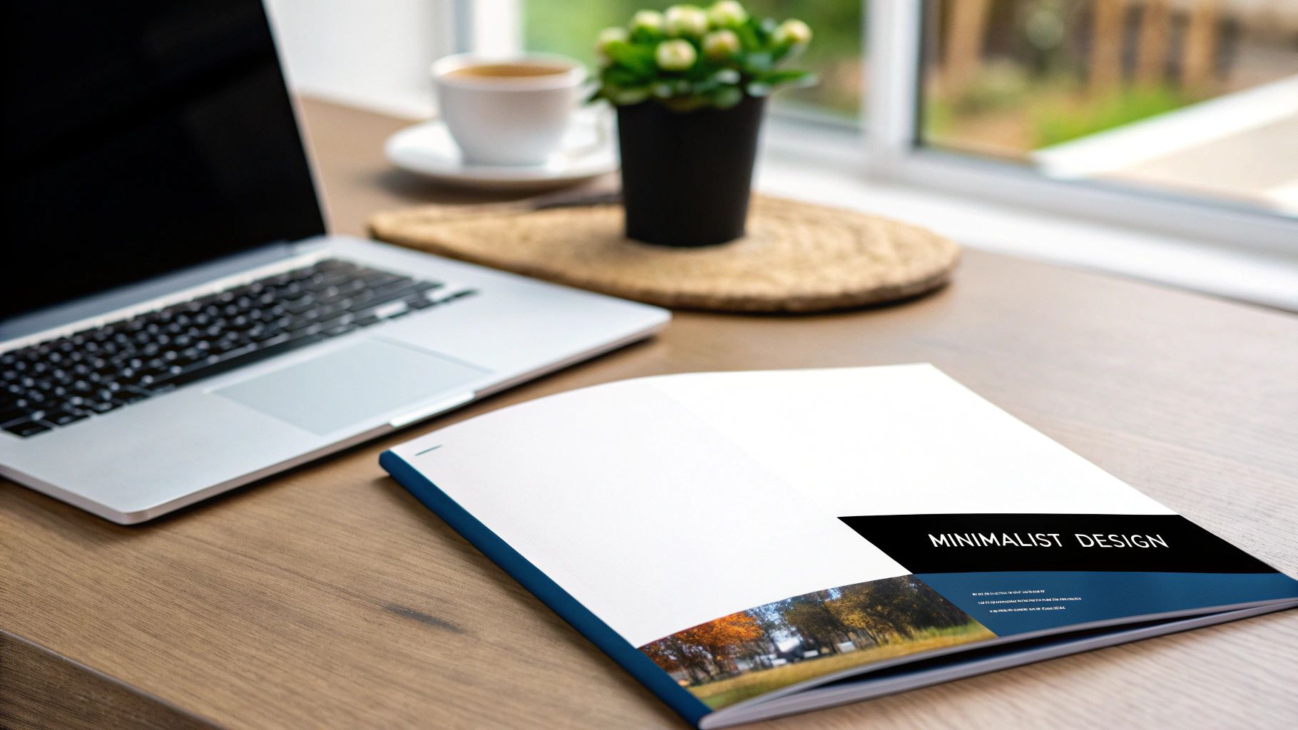
Minimalist clean design is more than just an aesthetic choice; it's a strategic communication tool. This approach, heavily influenced by the Swiss design movement and perfected by brands like Apple, prioritizes clarity and function. It strips away non-essential elements, allowing the core message to resonate with unparalleled focus. By leveraging generous negative space, a restricted color palette, and crisp typography, this style conveys sophistication, confidence, and trustworthiness. An awesome brochure design using this method guides the reader's eye intentionally, making complex information digestible and accessible.

Strategic Breakdown
The power of minimalism lies in its "less is more" philosophy. Consider the product brochures for high-end technology or financial services. They don't overwhelm you with starbursts and competing fonts. Instead, a single, high-quality product photograph is given room to breathe, accompanied by carefully selected text that highlights key benefits. This isn't emptiness; it's strategic space. The absence of clutter creates a visual hierarchy that tells the audience, "This is the most important thing to see," making the design incredibly effective.
Actionable Takeaways
To replicate this style, focus on these tactical elements:
- Embrace High-Contrast Typography: Pair a bold, clean sans-serif font like Helvetica or Proxima Nova for headlines with a lighter weight of the same family for body text. This creates a clear, readable hierarchy.
- Use a Grid System: A strict underlying grid is the backbone of minimalist design. It ensures every element, from text blocks to images, is perfectly aligned, creating an organized and harmonious layout.
- Invest in Quality Materials: The tactile experience is crucial. A heavy, uncoated paper stock or a matte finish laminate elevates the design, reinforcing the premium quality of the brand or service being presented.
- Select One Powerful Accent Color: Use a single, deliberate accent color to draw attention to key calls-to-action, like a website URL or phone number, without disrupting the overall clean aesthetic.
2. Die-Cut Interactive Design
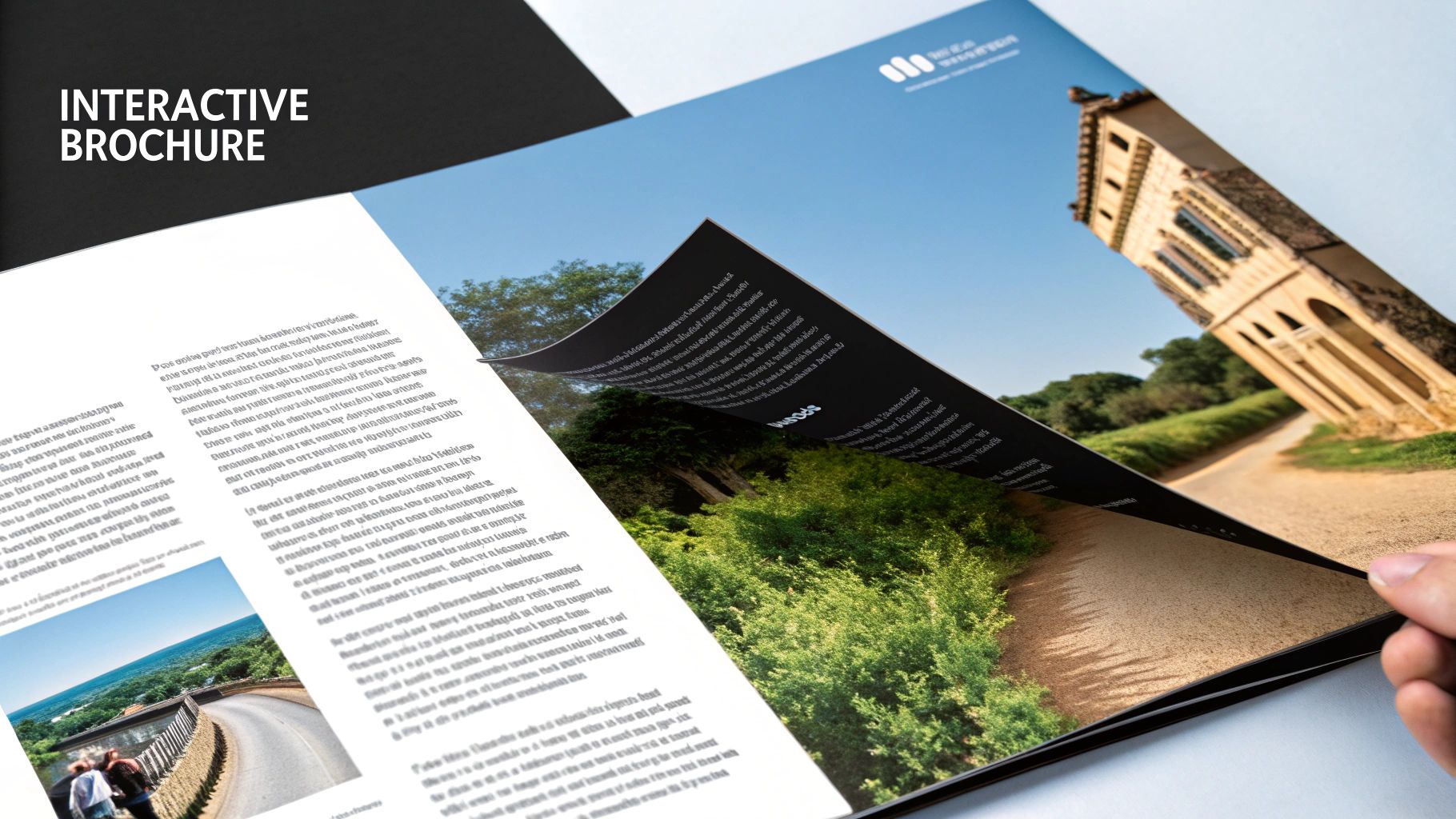
Die-cut interactive design transforms a standard brochure into a memorable, tactile experience. This technique uses custom-shaped cutouts, windows, and unique folding patterns to move beyond the traditional rectangular format. It invites physical interaction, creating visual surprises and a deeper level of engagement. An awesome brochure design using die-cuts can tell a story sequentially, reveal information dramatically, or simply create an object so unique it's kept rather than discarded, making the brand message more impactful and lasting.

Strategic Breakdown
The core strategy behind die-cutting is to generate curiosity and make the printed material an active part of the brand experience. Consider a real estate brochure where a die-cut door opens to reveal the property's stunning interior, or an automotive brochure where layered cutouts peel back to showcase a car’s engine technology. This isn't just a gimmick; it's purposeful interaction. By creating a physical path for the user to follow, the design encourages them to spend more time with the material, which significantly boosts information retention and brand recall.
Actionable Takeaways
To execute a successful die-cut design, strategic planning is essential:
- Consult Your Printer Early: Before finalizing your design, discuss your concept with your printing partner. They can provide critical guidance on what is technically feasible and cost-effective, preventing costly redesigns later.
- Create Physical Mockups: Digital proofs cannot replicate the feel and function of an interactive piece. Build and test physical prototypes to ensure the folds, cuts, and reveals work as intended and the final piece is durable.
- Design for the Reveal: Ensure the interactive element enhances your core message. The cutout should serve a purpose, such as framing a key product, revealing a call-to-action, or creating a clever visual metaphor related to your brand.
- Budget for Complexity: Die-cutting requires custom tooling and specialized labor, making it more expensive than standard printing. Allocate a sufficient budget to account for these higher production costs to achieve a high-quality finish.
3. Bold Typography-Focused Design
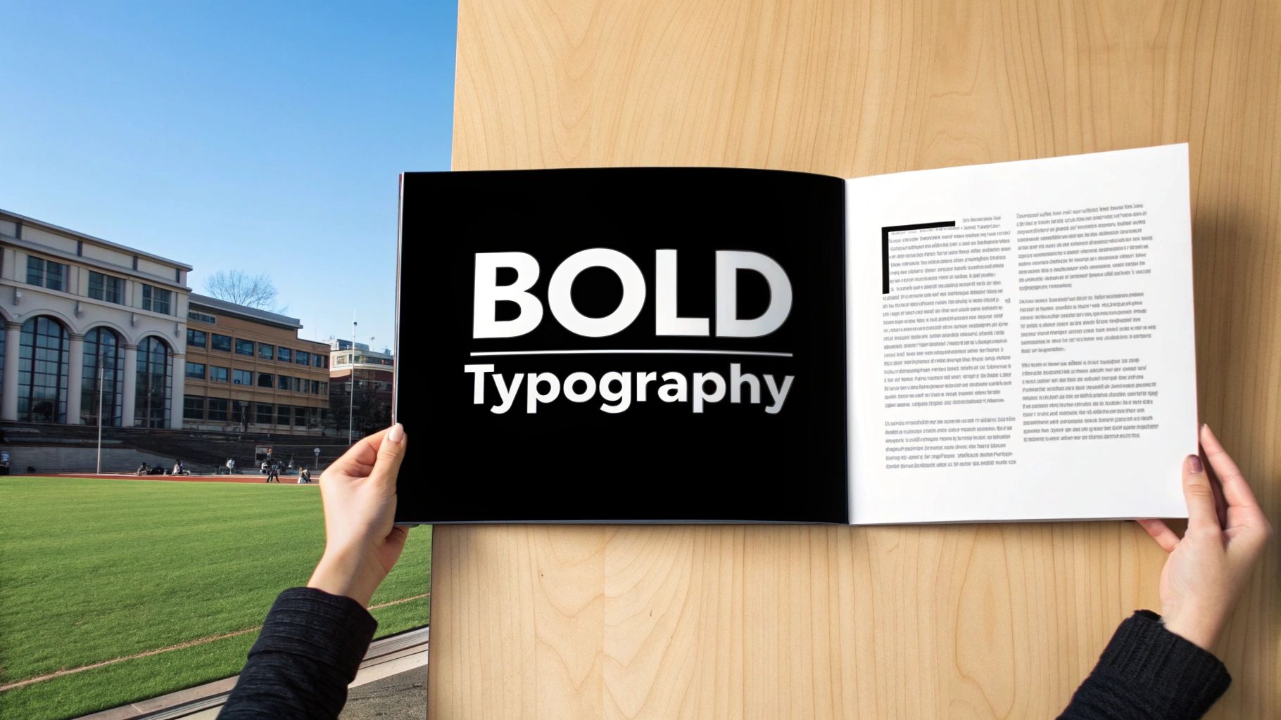
Bold typography-focused design elevates text from a simple carrier of information to the primary artistic element. This approach, heavily influenced by the Swiss typography movement and championed by modern brands like Spotify and Netflix, uses font choice, size, and layout as the main visual drivers. Instead of relying on images, typography itself creates mood, hierarchy, and impact. An awesome brochure design built on this principle grabs attention instantly, making a strong, confident statement before the reader even processes the words. It’s a powerful way to convey a message with clarity and artistic flair.

Strategic Breakdown
The strength of a typography-led design lies in its directness and character. Think of brochures for music festivals or bold non-profit campaigns. The letters themselves are the illustration, with oversized headlines and creative text arrangements guiding the eye. This isn't just about making text big; it's about strategic composition. By treating type as a graphic element, designers can create rhythm, texture, and a powerful visual narrative that supports the core message, making the design both memorable and incredibly effective at communicating a specific tone or feeling.
Actionable Takeaways
To execute this style effectively, concentrate on these specific tactics:
- Limit Your Font Families: Stick to a maximum of two or three complementary font families. A robust sans-serif for headlines paired with a clean serif for body copy often works well. This prevents visual chaos and maintains a professional look.
- Establish a Strong Hierarchy: Use significant variations in font size, weight (bold, regular, light), and color to create a clear visual hierarchy. Your main message should be the most dominant typographic element on the page.
- Let Typography Interact with Space: Allow your text to interact with the brochure's folds and edges. Let a large letter bleed off the page or wrap around a corner to create a dynamic and engaging layout.
- Prioritize Readability: While being creative, never sacrifice readability. Test your design by printing a draft to ensure that even the smallest text is legible and the overall layout is easy to follow at its actual size.
4. Infographic-Style Data Visualization
Infographic-style data visualization transforms dense, complex information into engaging and easily digestible visual narratives. This approach leverages the brain's ability to process images faster than text, using charts, icons, and illustrations to clarify statistics, processes, or specifications. Pioneered by publications like National Geographic and perfected in tech guides from Google, this method makes intricate topics accessible. An awesome brochure design using infographics doesn't just present data; it tells a story with it, guiding the reader through complex information with clarity and visual appeal, making it perfect for educational, financial, or technical content.

Strategic Breakdown
The core strength of this style is its ability to turn potential overwhelm into understanding. Think of a healthcare brochure explaining a medical procedure or a financial report detailing investment performance. Instead of paragraphs of text and confusing tables, this design uses a combination of icons, flowcharts, and color-coded graphs. This isn't just decoration; it's a cognitive shortcut. By structuring information visually, the design creates a logical flow that directs the reader's attention, highlights key findings, and makes the core message memorable and impactful.
Actionable Takeaways
To execute an infographic-style brochure effectively, concentrate on these tactics:
- Establish a Visual Hierarchy: Use size, color, and placement to guide the eye. The most critical data point should be the largest or most vibrant element, followed by supporting details in a clear, logical sequence.
- Maintain Brand Consistency: Develop a custom set of icons, a specific color palette, and a consistent typographic style that aligns with your brand identity. This ensures all visual elements feel cohesive and professional.
- Prioritize Clarity Over Complexity: Choose the right chart for your data. Use bar charts for comparisons, pie charts for percentages, and line graphs for trends. Avoid overly complicated or "chartjunk" visuals that obscure the message.
- Incorporate Narrative Flow: Use connecting lines, arrows, or numbered steps to create a clear path through the information. This turns a static collection of facts into a compelling story that is easy for the reader to follow from start to finish.
5. Photography-Driven Storytelling
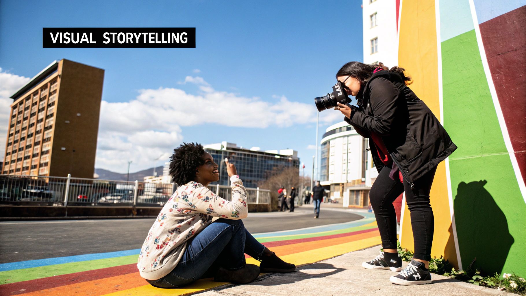
Photography-driven storytelling transforms a brochure from a simple document into an immersive experience. This approach uses powerful, high-quality images as the primary vehicle for conveying a narrative, evoking emotion, and building a connection with the audience. Pioneered by publications like National Geographic and perfected by brands such as Patagonia and luxury automotive companies, this technique relies on the principle that a picture is worth a thousand words. The text serves a supporting role, adding context and detail without distracting from the visual journey. An awesome brochure design that masters this method can transport a reader to a destination, make them feel the quality of a product, or inspire them to take action.
Strategic Breakdown
The core strategy here is to create an emotional resonance that text alone cannot achieve. Think of a luxury resort brochure. Instead of listing amenities, it shows a breathtaking, full-page photograph of a sun-drenched infinity pool overlooking a turquoise ocean. This single image communicates relaxation, exclusivity, and beauty far more effectively than a bulleted list. The visual narrative is carefully curated to guide the viewer’s feelings, from aspiration to desire to action. This isn't just about pretty pictures; it's about strategic visual communication where each photo is a chapter in a compelling story, making the brochure memorable and persuasive.
Actionable Takeaways
To execute a photography-led design, concentrate on these key tactics:
- Invest in Professional Photography: Stock photos often feel generic. Hire a professional photographer who understands your brand's story and can capture unique, high-resolution images that align with your message.
- Establish a Consistent Visual Tone: Ensure all your images have a cohesive look and feel. Use consistent color grading, lighting, and composition to create a unified brand aesthetic throughout the brochure.
- Prioritize Full-Bleed Layouts: Let your best images dominate the page. A full-bleed layout, where the photograph extends to the edges of the paper, creates a powerful, immersive effect that captivates the reader.
- Integrate Typography Thoughtfully: Place text carefully so it complements, rather than competes with, the imagery. Use clean, legible fonts and position text in areas of the photo with less detail, like the sky or a simple background.
6. Geometric Pattern and Shape Design
Geometric pattern and shape design uses mathematical precision, angles, and repetitive motifs to create a sense of order, innovation, and modernity. Drawing inspiration from movements like Bauhaus and popularized by tech giants like Google, this style communicates structure and creativity simultaneously. It leverages fundamental shapes like circles, squares, and triangles, arranging them into compelling compositions. An awesome brochure design built on this principle feels dynamic and purposeful, ideal for brands in technology, architecture, or contemporary arts.
Strategic Breakdown
The strength of geometric design is its ability to direct the eye and organize information logically. Think of an architecture firm's portfolio. The use of sharp lines and interlocking shapes mirrors the structural integrity of their buildings. It’s not just decorative; it’s symbolic communication. The patterns can be used as a background texture, a framing device for images, or as the main visual element. This creates a cohesive visual language that feels intentional, sophisticated, and forward-thinking, making complex concepts or services appear more structured and understandable.
Actionable Takeaways
To execute this style effectively, concentrate on these specific tactics:
- Create a Visual Rhythm: Use a repeating shape or pattern throughout the brochure panels. This creates consistency and guides the reader's journey through the content, establishing a predictable yet engaging flow.
- Balance Complexity and Readability: While intricate patterns are eye-catching, ensure they don't overpower your text. Use them as subtle backgrounds or confine them to specific sections to avoid compromising readability.
- Use Color to Define Shapes: Employ a contrasting color palette to make your geometric elements pop. Assign specific colors to different shapes or sections to build a clear visual hierarchy and separate distinct types of information.
- Integrate Photography with Shapes: Don't just place photos in rectangular boxes. Crop images into circles, hexagons, or other custom shapes that align with your geometric theme. This technique creates a more integrated and dynamic layout.
7. Vintage and Retro-Inspired Design
Vintage and retro-inspired design is a powerful way to evoke emotion, nostalgia, and a sense of enduring quality. This approach taps into the visual language of past decades, from the Art Deco elegance of the 1920s to the psychedelic funk of the 1970s. It’s not simply copying old designs; it's about reinterpreting them with modern sensibilities and production quality. By using period-specific typography, color palettes, and illustration styles, this design creates a rich narrative and an immediate sense of character. An awesome brochure design with a retro theme can make a brand feel authentic, established, and handcrafted.
Strategic Breakdown
The strength of vintage design lies in its ability to connect with a collective cultural memory. Consider brochures for craft distilleries or artisanal bakeries. They often use typography and imagery reminiscent of the pre-industrial or Prohibition eras to suggest time-honored recipes and quality craftsmanship. This isn't just a stylistic choice; it's a strategic association. The design leverages the audience's positive perceptions of a particular era, such as authenticity and attention to detail, and transfers those qualities directly onto the product or brand being presented, making the message instantly compelling.
Actionable Takeaways
To execute a convincing retro style, focus on these tactical elements:
- Research Your Era: Don't just guess. Deeply research the design conventions of your chosen decade. Look at old advertisements, packaging, and posters to understand the authentic use of fonts, colors, and layout structures.
- Balance Vintage with Readability: While period typography is key, some vintage fonts can be difficult to read in long-form text. Use ornate, stylistic fonts for headlines and pair them with a clean, classic serif or sans-serif font for body copy to ensure clarity.
- Use a Thematic Color Palette: Each era had a distinct color palette. The 1950s favored pastels like mint green and baby pink, while the 1970s leaned into earthy tones like avocado green and harvest gold. A consistent, era-appropriate palette is crucial for authenticity.
- Incorporate Texture and Illustration: Add visual interest with elements like subtle paper textures, distressed effects, or illustration styles common to the period. Line art, woodcut illustrations, or screen-print effects can significantly enhance the vintage feel.
8. Sustainable and Eco-Friendly Design
Sustainable and eco-friendly design is a powerful approach that aligns a brand's message with its environmental values. This method goes beyond mere aesthetics, integrating responsible choices into the entire lifecycle of the brochure, from material sourcing to final disposal. Brands like Patagonia and Tesla have successfully used this to build trust and connect with conscious consumers. It communicates a deep commitment to the planet through tangible means: recycled paper, soy-based inks, and production processes that minimize waste. An awesome brochure design built on these principles not only looks good but also feels good, offering a story of responsibility that resonates deeply with modern audiences.
Strategic Breakdown
The core strategy here is authenticity. An eco-friendly design must be genuine to be effective. For an organic food company or a renewable energy firm, a brochure printed on glossy, virgin paper stock with heavy chemical inks would create a jarring disconnect. Instead, this design approach uses earthy color palettes, natural textures, and imagery of nature to visually reinforce the brand's mission. The strategic choice of a matte, uncoated, 100% post-consumer recycled paper, for instance, isn't just a production detail; it's a primary messaging tool. It tells the recipient, "We practice what we preach," making the marketing collateral a physical embodiment of the company's ethos.
Actionable Takeaways
To execute an impactful eco-friendly design, consider these tactical elements:
- Choose Certified Materials: Opt for paper stocks that are FSC (Forest Stewardship Council) certified or contain a high percentage of post-consumer recycled content. This provides a credible, verifiable eco-credential.
- Design for Less Ink Coverage: Create layouts that use negative space effectively and avoid large, solid blocks of dark ink. This not only reduces ink consumption but can also lower printing costs and drying times.
- Use Earth-Toned Color Palettes: Incorporate colors found in nature, like greens, browns, and blues. This visually reinforces the sustainability message and creates a calm, organic feel.
- Communicate Your Choices: Add a small icon or a line of text indicating the sustainable nature of the brochure (e.g., "Printed on 100% recycled paper with soy-based inks"). This explicitly informs the reader of your commitment and educates them on your brand's values.
8 Styles of Awesome Brochure Design Compared
| Design Style | Implementation Complexity ? | Resource Requirements ⚡ | Expected Outcomes ? | Ideal Use Cases ? | Key Advantages ⭐ |
|---|---|---|---|---|---|
| Minimalist Clean Design | Low to moderate | Low to moderate (quality content & materials) | Clear, professional, and timeless visuals | Corporate, healthcare, finance, digital formats | Timeless look, easy readability, cost-effective |
| Die-Cut Interactive Design | High | High (complex printing & prototyping) | Memorable, engaging, and innovative | Luxury brands, automotive, fashion, real estate | Strong brand differentiation, tactile engagement |
| Bold Typography-Focused Design | Moderate | Low to moderate (copywriting focus) | Powerful message delivery with strong visual impact | Message-driven campaigns, music, tech startups | High impact, scalable, cost-effective |
| Infographic-Style Data Visualization | High | High (design expertise, data accuracy) | Accessible complex info with high engagement | Educational, financial, healthcare, technology | Clarifies complexity, educational, shareable |
| Photography-Driven Storytelling | Moderate to high | High (professional photography) | Emotional connection, aspirational branding | Travel, lifestyle, luxury, real estate | Strong emotion, universal appeal, versatile |
| Geometric Pattern and Shape Design | Moderate to high | Moderate | Modern, innovative, and tech-oriented appearance | Tech, architecture, startups, modern art | Modern look, strong identity, scalable |
| Vintage and Retro-Inspired Design | Moderate | Moderate | Nostalgic, distinctive, and emotionally evocative | Craft products, vintage fashion, automotive restoration | Strong nostalgia, memorable, authentic storytelling |
| Sustainable and Eco-Friendly Design | Moderate | Moderate to high (special materials) | Authentic sustainability branding, eco-conscious appeal | Organic products, renewable energy, eco-tourism | Appeals to green consumers, reduces environmental impact |
From Inspiration to Implementation: Your Next Steps
We've journeyed through a curated gallery of truly awesome brochure design, deconstructing the strategic thinking behind each masterpiece. From the clean, focused messaging of minimalist layouts to the engaging tactile experience of die-cut creations, a powerful theme emerges: exceptional design is never just about aesthetics. It's a calculated, strategic process rooted in a deep understanding of brand, audience, and objectives.
The examples showcased prove that a brochure is far more than a simple handout. It's a physical extension of your brand story, a tangible piece of communication that can forge a memorable connection in an increasingly digital world. The success of these designs lies in their deliberate choices, whether it's using bold typography to command attention, leveraging infographics to simplify complexity, or employing sustainable materials to communicate core values.
Synthesizing the Core Strategies
The most impactful takeaway is that the best design approach is the one that authentically serves your message. You don't need to implement every trend. Instead, focus on the core principles we've analyzed:
- Clarity Before Creativity: Before choosing a single font or color, define your primary goal. What is the one thing you want your reader to do, think, or feel after interacting with your brochure? This singular focus is the foundation of an awesome brochure design.
- Form Follows Function: The physical format of your brochure, from its fold to its paper stock, should enhance your message. An interactive die-cut is perfect for a creative agency reveal, while a sturdy, infographic-heavy z-fold works well for a technical product guide.
- Consistency is Key: Your brochure must feel like part of a larger brand ecosystem. The visual language, tone of voice, and core messaging should align seamlessly with your website, social media, and other marketing materials. This consistency builds trust and brand recognition.
Your Action Plan for Awesome Brochure Design
Moving from inspiration to execution can feel daunting, but you can channel the insights from this article into a structured plan. Start by asking these critical questions:
- Who is my audience and what do they care about? A design for tech developers will differ vastly from one for art gallery patrons.
- What is my core message? Distill your primary communication goal into a single, powerful sentence.
- Which design style aligns with my brand identity? Review the examples, from retro to photography-driven, and identify the strategy that best reflects your brand's personality and values.
- How can I bridge the physical-digital gap? Ensure your brochure includes clear calls to action, such as QR codes linking to a landing page, social media handles, or a specific hashtag.
By methodically working through these steps, you transform abstract ideas into a concrete creative brief. This brief will become your roadmap, guiding every decision and ensuring your final product is not only beautiful but also strategically effective. Mastering this process elevates your marketing, turning a simple piece of paper into a powerful tool for connection and conversion.
The insights you've gained from analyzing these designs are valuable assets. To make sure you retain and reuse these key takeaways for future projects, you need a smart way to capture them. Tnote is designed for exactly this purpose, allowing you to transform your notes and strategic insights into shareable knowledge cards. Use it to distill the core principles of an awesome brochure design and keep them ready for your next creative brief.