In a world saturated with information, how do we make learning stick? The answer lies not in working harder, but in learning smarter. Our brains are wired to process visual information with incredible efficiency, significantly faster than plain text. This innate preference for visuals is the key to unlocking deeper understanding, better memory retention, and higher engagement with complex subjects.
This article moves beyond generic advice to provide a comprehensive roundup of powerful visual learning strategies you can implement today. We will explore eight distinct, actionable techniques, from mind mapping and infographics to interactive simulations. Each entry includes detailed explanations, real-world examples, and practical tips to help you transform dense information into clear, memorable knowledge.
Whether you're a student facing a challenging exam, an educator designing a lesson plan, or a professional aiming to master a new skill, this guide offers a structured approach. Prepare to discover how to leverage your brain's natural processing power and conquer any topic with confidence. These methods are designed to be immediately applicable, providing you with a versatile toolkit for more effective and engaging learning.
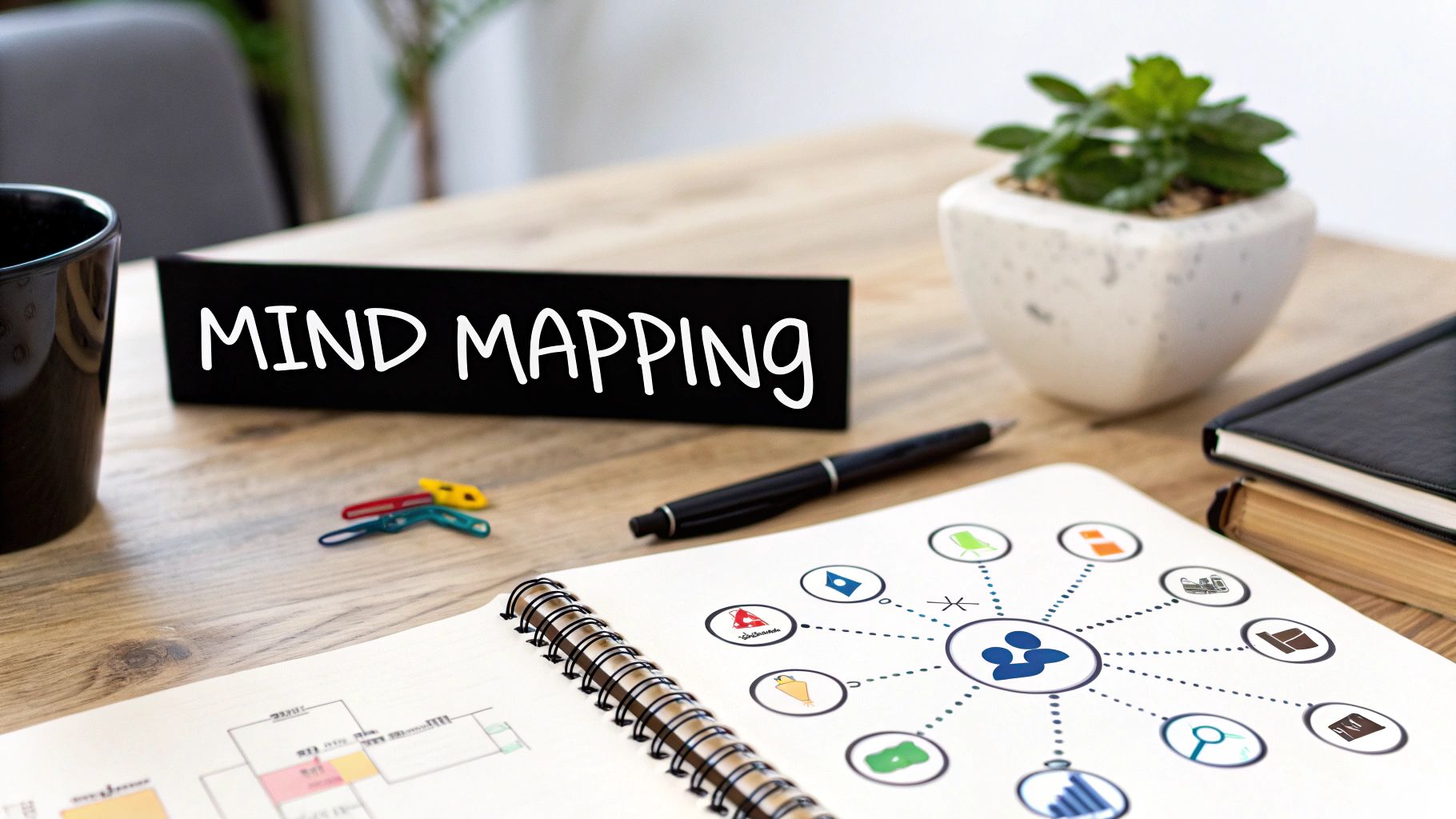
1. Mind Mapping
Mind mapping is a powerful visual learning strategy that mirrors the brain's natural way of thinking: through association. It's a non-linear diagram that organizes information around a single, central concept. From this core idea, you draw branches to major topics and then create smaller, sub-topic branches, forming a radiant structure that visually connects related pieces of information. This method transforms long lists of monotonous information into a colorful, memorable, and highly organized diagram that is much easier to process and recall.
Why It Works So Well
The effectiveness of mind mapping lies in its ability to engage your whole brain. It combines logic and structure (left brain) with imagination, color, and spatial awareness (right brain). This synergy enhances clarity, boosts creativity, and significantly improves memory retention. By using keywords, colors, and images, you create strong visual triggers that make recalling complex information much more intuitive.
How to Implement Mind Mapping
You can create mind maps with a simple pen and paper or use digital tools like MindMeister or XMind. Follow these steps for an effective map:
- Start in the Center: Begin with a clear, central image or word that represents your main topic.
- Use Keywords: Attach your main themes to the central image on thick branches. Use single, powerful keywords or very short phrases on each branch.
- Branch Out: From your main themes, create smaller, "child" branches for supporting details. The structure should be hierarchical.
- Color-Code Your Branches: Assign distinct colors to different themes. This helps visually separate and categorize information, making the map easier to read at a glance.
- Add Images and Symbols: Incorporate simple icons and images wherever possible. A picture truly is worth a thousand words and aids memory recall.
- Use Curved Lines: Draw curved, organic lines instead of straight ones. The brain finds these more visually engaging and less rigid.
2. Concept Mapping
Concept mapping is a highly structured visual learning strategy designed to illustrate the relationships between different ideas. Unlike the more radiant mind map, a concept map is organized hierarchically and uses labeled lines to explicitly define the connections between concepts. This method allows you to build a logical framework of knowledge, showing not just that ideas are related, but precisely how they are related, making it ideal for representing complex systems and formal knowledge.

Why It Works So Well
The power of concept mapping, a technique developed by Joseph Novak at Cornell, lies in its ability to promote meaningful learning over rote memorization. By forcing you to identify key concepts and articulate the links between them with specific "linking words" (e.g., "causes," "contributes to," "is composed of"), you engage in a deeper level of cognitive processing. This structured approach helps organize complex information logically, clarify thinking, and reveal new connections you might not have noticed otherwise, solidifying your understanding.
How to Implement Concept Mapping
You can create concept maps on a whiteboard or use digital tools like Lucidchart or CmapTools from IHMC. Here’s a systematic approach:
- Start with a Focus Question: Begin with a specific problem or question you want to answer. For example, "What are the primary factors contributing to climate change?"
- Identify Key Concepts: Brainstorm a list of 15-25 essential concepts, terms, and ideas related to your focus question.
- Rank and Arrange: Place the most general, inclusive concept at the top of your map. Arrange the other concepts hierarchically underneath, moving from broad to more specific.
- Connect with Linking Words: Draw lines between related concepts and add a short phrase or verb on the line to describe the relationship. This is the most critical step.
- Look for Cross-Links: Identify and draw connections between concepts in different branches of your map. These cross-links often represent moments of significant insight and a more integrated understanding.
3. Infographics
Infographics are one of the most effective visual learning strategies for transforming complex data and dense information into a compelling, easily digestible format. They combine text, icons, charts, and images into a single, cohesive graphic that tells a story or explains a concept at a glance. By organizing information visually and prioritizing key takeaways, infographics make intricate topics like scientific processes or historical timelines much more accessible and memorable for the learner.

Why It Works So Well
The power of infographics lies in their ability to leverage the brain's natural preference for visual information. The human brain processes images 60,000 times faster than text, and infographics capitalize on this by presenting data in a visually engaging narrative. This reduces cognitive load, allowing the viewer to quickly identify patterns, trends, and relationships that might be lost in a block of text. This visual appeal not only grabs attention but also significantly boosts retention.
How to Implement Infographics
Creating a powerful infographic is easier than ever with user-friendly tools like Canva or Piktochart, alongside professional software like Adobe Illustrator. Follow these steps to build an effective visual aid:
- Define a Core Message: Start with a single, clear objective. What is the one key takeaway you want your audience to remember? Every element should support this central theme.
- Organize Your Data: Gather and structure your information logically. Group related points together to create a natural flow, guiding the viewer’s eye from one section to the next.
- Balance Visuals and Text: Use a mix of icons, charts, and brief text snippets. The goal is to show, not just tell. Keep sentences short and use visuals to illustrate your points.
- Maintain Visual Consistency: Stick to a limited color palette and two to three consistent fonts. This creates a professional, organized look that is easy on the eyes and reinforces your brand or topic.
- Cite Your Sources: Build credibility by including a small section at the bottom citing where your data came from. This is crucial for topics in finance, healthcare, or academic research.
4. Flowcharts and Process Diagrams
Flowcharts are structured visual representations that map out processes, procedures, or decision-making sequences. Using standardized symbols and directional arrows, these powerful diagrams break down complex workflows into clear, step-by-step visual paths. They illustrate the logical flow from a starting point to an end point, making them one of the most effective visual learning strategies for understanding and analyzing sequential information.

Why It Works So Well
The strength of a flowchart lies in its ability to bring order to chaos. By visualizing a process, you can easily identify potential bottlenecks, redundancies, or points of failure that are often hidden in text-based descriptions. This method forces logical thinking and provides a universal language that simplifies communication across different teams or departments, from software developers mapping user authentication flows to healthcare facilities outlining patient admission procedures.
How to Implement Flowcharts
Creating a clear and effective flowchart is straightforward with digital tools like Lucidchart or diagrams.net, or even just a pen and paper. Follow these best practices:
- Use Standard Symbols: Adhere to conventional flowchart symbols (ovals for start/end, rectangles for processes, diamonds for decisions) to ensure your diagram is universally understood.
- Maintain a Clear Flow: Work from top to bottom or left to right. Ensure arrows clearly indicate the directional flow of the process.
- Keep Text Concise: Each shape should contain a brief, action-oriented description. Avoid long sentences; use keywords and short phrases instead.
- Define Scope: Clearly establish the start and end points of the process you are mapping. A process should have a single entry point and a defined exit point.
- Test the Logic: Walk through the diagram step-by-step to verify that the logic is sound and accurately reflects the real-world process. This helps catch errors before implementation.
5. Visual Note-Taking (Sketchnoting)
Visual note-taking, often called sketchnoting, is a dynamic method that elevates traditional note-taking by blending handwritten text with drawings, symbols, diagrams, and other visual elements. Instead of passively transcribing words, you actively process information in real-time, creating a visual story of the content. This approach, popularized by figures like Mike Rohde, transforms linear, text-heavy notes into an engaging and personalized visual map of key ideas.
Why It Works So Well
Sketchnoting is a powerful visual learning strategy because it forces you to listen, synthesize, and visualize information simultaneously. This multi-sensory process engages different parts of your brain, creating stronger neural pathways for memory. By translating abstract concepts into concrete images and structures, you deepen your understanding and build a much more memorable record. The act of drawing and organizing information spatially makes recall feel more like re-exploring a map than reading a script.
How to Implement Sketchnoting
Anyone can learn to sketchnote; artistic skill is not a prerequisite. The focus is on capturing ideas, not creating masterpieces. You can start with a notebook and a pen or use a tablet app like Procreate or GoodNotes.
- Start with the Basics: Don't feel pressured to draw complex illustrations. Begin with simple shapes like squares, circles, and triangles, along with arrows and containers to structure your notes.
- Build a Visual Vocabulary: Develop a personal library of simple icons for common concepts (e.g., a lightbulb for an idea, a magnifying glass for research). This speeds up your note-taking process.
- Listen for Key Concepts: You can't capture every word, so focus on listening for the main points, surprising facts, and key takeaways. Let go of the need for perfection.
- Establish Hierarchy: Use visual cues to show importance. Write main ideas in larger letters, use bold lines for key connectors, or place central themes in the middle of the page.
- Practice Consistently: Like any skill, sketchnoting improves with practice. Try it during a meeting, a lecture, or while watching a TED Talk to build fluency and confidence.
6. Timeline Visualization
Timeline visualization is a powerful method for understanding chronology and sequence. It organizes events, processes, or historical developments along a linear axis, making it easy to see the order of occurrences, their duration, and the relationships between them. By plotting key moments in time, this visual learning strategy transforms complex sequences into a clear, digestible narrative, helping learners grasp cause-and-effect relationships and the broader context of a subject.
Why It Works So Well
The human brain is wired to understand stories and sequences. Timelines tap directly into this by presenting information as a narrative progression, which is far more memorable than a disconnected list of dates and facts. This method clearly illustrates historical context, project phases, or scientific developments, allowing you to see how one event leads to another. The visual spacing between points on the timeline also provides an intuitive sense of duration and the passage of time, adding another layer of comprehension.
How to Implement Timeline Visualization
Creating a timeline can be done with a simple ruler and paper or with advanced digital tools like Tiki-Toki or TimelineJS. Here’s how to build an effective one:
- Establish a Clear Scope: Define the start and end points of your timeline. Whether it’s the life of an artist or the phases of a software launch, a clear scope is crucial.
- Choose an Appropriate Scale: Select a time scale (years, months, days) that best fits your subject. The spacing between points should be consistent to accurately represent time intervals.
- Plot Key Milestones: Add the most significant events or stages to your timeline. Use visual cues like larger text, bold colors, or distinct icons to highlight these major points.
- Add Contextual Details: For each point, include a brief, concise description of what happened and why it is important. Avoid overcrowding the timeline with too much text.
- Incorporate Visuals: Use relevant images, icons, or symbols next to key events. A small portrait for a historical figure or a product icon for a company milestone can significantly boost recall.
7. Graphic Organizers
Graphic organizers are structured visual frameworks that help learners organize information, clarify relationships between concepts, and guide their thinking processes. Unlike the free-flowing nature of a mind map, these templates provide deliberate scaffolding to categorize, compare, sequence, or analyze information in a systematic format. Think of them as visual blueprints for knowledge, transforming complex data into a digestible and coherent structure. For example, a high school student might use a persuasion map to organize arguments for an essay, while a science class could use a cause-and-effect chart to analyze an experiment's results.
Why It Works So Well
The power of graphic organizers lies in their ability to make abstract concepts concrete and visible. By providing a clear structure, they reduce cognitive load, freeing up mental resources to focus on understanding the material rather than just trying to organize it. This visual scaffolding is particularly effective for showing relationships like cause-and-effect, comparison, or sequence, which can be difficult to grasp from text alone. This is one of the most versatile visual learning strategies because it can be adapted to almost any subject or complexity level.
How to Implement Graphic Organizers
From simple Venn diagrams to complex flowcharts, graphic organizers are easy to implement with pen and paper or digital tools. The key is choosing the right organizer for your learning goal.
- Match the Organizer to the Objective: Select a template that aligns with your task. Use a Venn diagram for comparing and contrasting, a sequence chart for chronological events, or a K-W-L chart (What I Know, What I Want to Know, What I Learned) for activating prior knowledge.
- Model Its Use First: Before asking students or team members to work independently, demonstrate how to fill out the organizer with a familiar example. This ensures everyone understands the framework.
- Color-Code for Clarity: Use different colors to highlight distinct categories, ideas, or data points. This adds another layer of visual organization and makes the information easier to scan and recall.
- Encourage Customization: Allow learners to modify or create their own organizers. This promotes deeper engagement and ownership of the learning process, as they can adapt the structure to fit their unique thought patterns.
8. Interactive Visual Simulations
Interactive visual simulations are dynamic, computer-based models that allow you to actively explore complex systems. Instead of passively observing, you manipulate variables and immediately see the outcomes in a controlled, virtual environment. This strategy provides a hands-on learning experience for scenarios that would be too dangerous, expensive, or impractical to replicate in the real world, making it a cornerstone of modern visual learning strategies.
Why It Works So Well
Simulations excel by bridging the gap between theoretical knowledge and practical application. They create a safe space for trial and error, which is crucial for deep understanding and skill mastery. By actively engaging with the content, you build a stronger mental model of how systems work. This active participation promotes critical thinking and problem-solving skills far more effectively than static diagrams or text, leading to significantly higher retention of complex concepts.
How to Implement Interactive Visual Simulations
You can leverage a wide range of platforms, from dedicated educational sites like PhET Interactive Simulations to advanced VR programs. To get the most out of them, follow these steps:
- Set a Clear Goal: Before starting, define what you want to learn or test. Are you trying to understand a specific physics law or a biological process? A clear objective focuses your exploration.
- Guide Initial Exploration: If you're new to a simulation, follow a guided tutorial first. Once you understand the controls and variables, you can begin experimenting independently.
- Formulate a Hypothesis: Treat it like a real experiment. Predict what will happen when you change a variable, then run the simulation to test your hypothesis.
- Reflect and Discuss: After using the simulation, take time to reflect on what you observed. Discuss your findings with peers or a teacher to solidify your understanding and connect it to real-world applications.
- Supplement, Don't Replace: Use simulations to complement other learning methods. Combine them with readings, lectures, and real-life labs for a well-rounded educational experience.
Visual Learning Strategies Comparison Table
| Method | Implementation Complexity 🔄 | Resource Requirements ⚡ | Expected Outcomes 📊 | Ideal Use Cases 💡 | Key Advantages ⭐ |
|---|---|---|---|---|---|
| Mind Mapping | Moderate – requires practice | Low – pen/paper or basic software | Enhanced creativity, memory retention | Brainstorming, note-taking, project planning | Visualizes connections; boosts creativity & memory |
| Concept Mapping | High – needs good topic understanding | Moderate – software helpful but not mandatory | Deep understanding, identifies knowledge gaps | Complex systems, scientific concepts, cause-effect analysis | Shows detailed relationships with labeled links |
| Infographics | High – design skills or tools needed | Moderate to high – design software/platforms | Increased retention, broad accessibility | Data presentation, marketing, public awareness | Engaging, visually appealing summaries |
| Flowcharts & Process Diagrams | Moderate – standardized symbols | Low to moderate – diagram tools or paper | Clear process flows, bottleneck identification | Process documentation, troubleshooting, workflow optimization | Standardized, clarifies sequential processes |
| Visual Note-Taking (Sketchnoting) | Moderate – practice to develop skill | Low – pen/paper or tablet | Improved engagement and recall | Lecture notes, meetings, personal learning | Combines visuals and text; personal and memorable |
| Timeline Visualization | Low to Moderate – straightforward | Low to moderate – timeline tools or templates | Clear sequence, historical context | History education, project planning, evolution/trend tracking | Shows chronological progression and milestones |
| Graphic Organizers | Low – predefined templates | Low – paper or digital templates | Structured thinking, improved comprehension | Reading comprehension, writing prep, critical thinking | Supports diverse learning styles; easy to use |
| Interactive Visual Simulations | High – tech and digital literacy needed | High – computers/tablets, software, VR gear | Hands-on experimentation, tangible abstract concepts | STEM education, professional training, skill development | Interactive, safe environment for exploration |
From Theory to Action: Integrating Visual Strategies into Your Daily Routine
We have journeyed through a powerful collection of visual learning strategies, exploring the intricate webs of mind maps, the logical precision of flowcharts, and the dynamic storytelling of infographics. The core lesson is clear: our brains are hardwired to process and retain visual information far more effectively than dense text alone. By transforming abstract concepts into tangible, visual forms, you unlock deeper comprehension, enhance memory recall, and make the entire learning process more engaging and intuitive.
The true power of these techniques lies not in their complexity, but in their adaptability. You don't need to be a graphic designer to create a compelling timeline or a detailed concept map. The goal is to find the methods that align with your specific needs and learning preferences. A student tackling a history exam might lean heavily on timeline visualizations, while a project manager will find immense value in crafting detailed flowcharts and process diagrams. The common thread is the intentional act of converting information into a visual structure, a process that forces clarity and solidifies understanding.
Making Visual Learning a Habit
The transition from understanding these strategies to implementing them is where the real transformation begins. The key is to start small and build momentum. Don't try to overhaul your entire study or work routine overnight. Instead, choose one specific, low-stakes task this week and apply a single visual technique.
Here’s a simple plan to get started:
- Identify a Target: Select a single piece of information you need to learn. This could be notes from a lecture, a chapter from a textbook, or the key points from a business meeting.
- Choose Your Tool: Pick one of the eight strategies we discussed. If you're feeling creative, try sketchnoting. If you need to understand connections between ideas, a concept map is a perfect choice.
- Commit to Action: Dedicate just 15-20 minutes to creating your visual. The focus is on the process, not a perfect final product. Sketch a quick mind map for your next essay, or draw a simple flowchart to understand a scientific process.
- Reflect and Iterate: After you've created your visual, take a moment to reflect. Did it help clarify the topic? Was it easier to recall the information later? Use this feedback to decide if this is a strategy you want to use again.
By consistently applying these visual learning strategies, you are not just memorizing facts; you are building a robust cognitive toolkit. You are training your brain to see patterns, make connections, and construct meaning in a more dynamic way. This skill transcends the classroom and the office, enhancing your ability to communicate complex ideas, solve problems creatively, and ultimately, become a more effective and lifelong learner.
Ready to put these visual learning strategies into practice without the steep learning curve of complex design software? TNote is the perfect tool to bridge the gap between your text notes and shareable visual content. Effortlessly transform your Markdown notes into beautiful, professional-looking knowledge cards with the md2card feature. Start turning your insights into impactful visuals today. Explore TNote and accelerate your learning journey.