Unlocking Visual Impact: Your Guide to Modern Banner Design
In a visually crowded online space, a banner must do more than just exist; it must capture attention and deliver a message instantly. For students crafting a project, educators designing course materials, or creators building a brand, a compelling banner is a critical communication tool. A generic design is easily ignored, but a thoughtful one can stop the scroll and drive engagement. This guide bypasses the usual advice to provide a curated collection of impactful and actionable banner design ideas.
We will explore seven distinct concepts, moving from the sophisticated clarity of minimalist typography to the dynamic appeal of animated elements. Each section is built to provide practical implementation details and clear examples, empowering you to create visuals that not only look professional but also achieve specific goals. Forget cookie-cutter templates. This is your resource for developing fresh, effective banner designs that connect with your audience and make a lasting impression. Prepare to elevate your visual strategy with ideas that are both creative and functional.
1. Minimalist Design with Bold Typography
Minimalism in banner design is about strategic subtraction. This approach focuses on creating maximum impact with the fewest possible elements, letting a powerful message take center stage. By embracing generous whitespace and a clean layout, minimalist design ensures your core message is not just seen, but felt. It's a confident style that communicates clarity and sophistication, making it one of the most effective banner design ideas for brands that want to appear modern and direct.
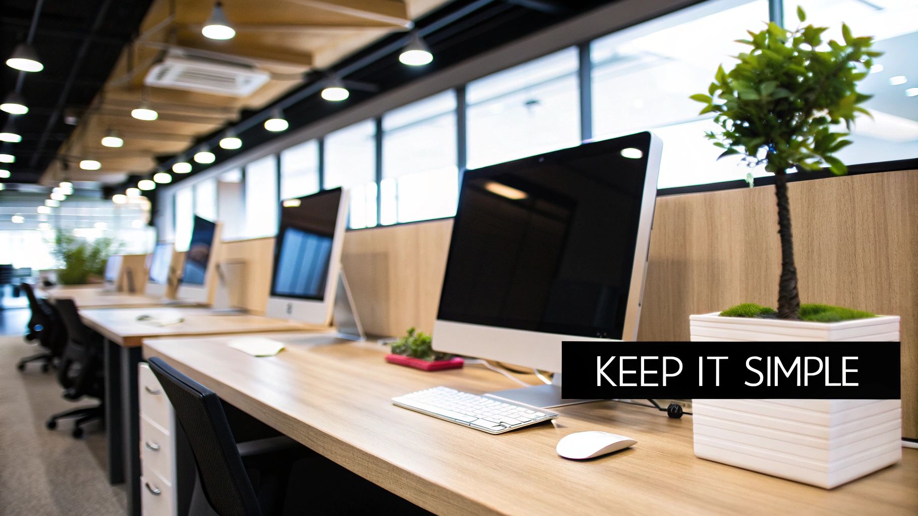
This design philosophy, heavily influenced by the Swiss and Bauhaus movements and famously perfected by Apple, hinges on one dominant element: bold typography. The font choice becomes the primary visual, conveying personality, tone, and information all at once. Think of Nike’s iconic "Just Do It" campaigns or Spotify's artist promotions; they often feature a simple background with a compelling typographic statement. The absence of clutter forces the viewer's eye directly to the text, making the message instantly digestible and memorable.
When to Use This Approach
This style is ideal when you have a short, powerful message or a single, clear call to action (CTA). It works exceptionally well for tech companies, fashion brands, educational institutions announcing a key event, or any creator promoting a single piece of content like a new video or podcast episode. If your goal is to convey elegance, confidence, and focus, this is the perfect strategy.
Actionable Implementation Tips
To execute this style effectively, focus on precision and contrast. Every element must be intentional.
- Prioritize High Contrast: Ensure your text is immediately readable. Classic black text on a white background is timeless, but you can also use a vibrant brand color for either the text or the background to create a memorable visual pop.
- Select a "Hero" Font: Choose a single typeface that embodies the personality of your message. A strong, sans-serif font like Helvetica or Futura can feel modern and assertive, while a classic serif font might evoke tradition and authority.
- Keep Copy Concise: Aim for seven words or fewer. The goal is a quick, impactful statement. For example, instead of "Register Now for Our Upcoming Webinar on Digital Marketing," try "Master Digital Marketing. Register Now."
- Test for Readability: Your banner will be seen on various screen sizes. Make sure your text is legible on a small mobile device as well as on a large desktop monitor.
2. Photo-Centric Visual Storytelling
Photo-centric visual storytelling is a banner design approach where a high-quality, evocative photograph serves as the foundation of the entire composition. Instead of being just another element, the image is the narrative. This technique leverages the old adage that "a picture is worth a thousand words," using powerful imagery to connect with the audience on an emotional level. The goal is to make the viewer feel something, whether it's inspiration, desire, or curiosity, creating a strong and immediate brand association.
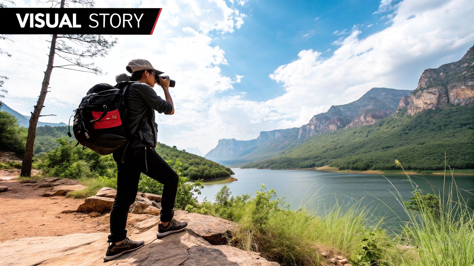
This method, deeply rooted in the advertising principles of David Ogilvy and popularized by visual-first platforms like Instagram and publications like National Geographic, uses the photograph to do the heavy lifting. Supporting text, such as a headline or call to action, is integrated seamlessly, often appearing as a subtle overlay or placed strategically in negative space. Think of Patagonia's adventure campaigns or a travel site's destination banners; the stunning photo tells the primary story, and the text simply provides context or a path to action. This makes it one of the most compelling banner design ideas for building a lifestyle brand.
When to Use This Approach
This style is exceptionally effective for brands and creators in travel, food, fashion, environmental causes, or any field where lifestyle and aspiration are key selling points. Use it when your goal is to evoke a specific mood, tell a story, or sell an experience rather than just a product. It's perfect for promoting a travel documentary, a new recipe collection, an outdoor gear sale, or a university's study abroad program. If you want your audience to imagine themselves in the scene, this is your strategy.
Actionable Implementation Tips
Success with this approach depends on the harmony between image and text. The photograph must be powerful, and the text must support it without competing.
- Apply the Rule of Thirds: Place your key text elements along the grid lines or at the intersections of the rule of thirds. This creates a more balanced and dynamic composition, guiding the viewer's eye naturally from the image's focal point to your message.
- Use Subtle Overlays: If your text gets lost in a busy photo, apply a semi-transparent color overlay or a soft gradient behind the text. This technique improves readability without completely obscuring the background image.
- Choose Aspirational Images: Select photos that reflect your target audience's goals and desires. A university targeting prospective students might use a photo of a vibrant campus life, not just a building.
- Optimize for the Web: Ensure your high-quality images are compressed for fast loading times. A beautiful banner is useless if it slows your page down and users click away before it even appears.
3. Animated and Interactive Elements
Static images communicate a message, but animated banners bring that message to life. This approach uses motion graphics, subtle animations, or interactive features to break through the visual noise of a webpage. By incorporating movement, these dynamic banners guide the viewer's eye, tell a short story, and create a more engaging experience that static designs simply cannot match. This is one of the most powerful banner design ideas for capturing attention in a crowded digital space.
The core principle, drawing inspiration from Disney's foundational principles of animation and refined by modern standards like Google's Material Design, is that motion should have a purpose. It isn't just decoration; it's a tool for clarification, emphasis, and engagement. Think of Mailchimp's playful animated characters that add personality to their campaigns, or Spotify's year-end "Wrapped" banners that use motion to visualize user data. The movement grabs attention and makes the information more memorable and delightful.
When to Use This Approach
This style is perfect for campaigns where grabbing immediate attention is critical. It's highly effective for product launches, special promotions, event announcements, or any scenario where you want to create a "wow" factor. For educators, an animated banner can make a course announcement feel more exciting. For content creators, it can tease a new video or project in a dynamic way that encourages clicks. If your goal is to stand out and create a memorable, interactive moment, this is the strategy to use.
Actionable Implementation Tips
Successful animation is about balance, not overwhelming the user. The goal is to enhance, not distract.
- Keep Animations Short and Sweet: Aim for an animation loop that lasts under five seconds. The initial movement should capture attention quickly without becoming repetitive or annoying.
- Animate the Call-to-Action (CTA): Use subtle motion to draw the eye to your main button. A slight pulse, a color change, or a slide-in effect can significantly increase click-through rates.
- Prioritize Performance: Animated banners can be larger in file size. Test your banner's loading speed on slower connections to ensure it doesn't negatively impact the user experience. Compress files where possible.
- Ensure Accessibility: For any animations that loop, consider adding a pause or stop control. This gives users control over their experience, which is crucial for accessibility and avoiding user frustration.
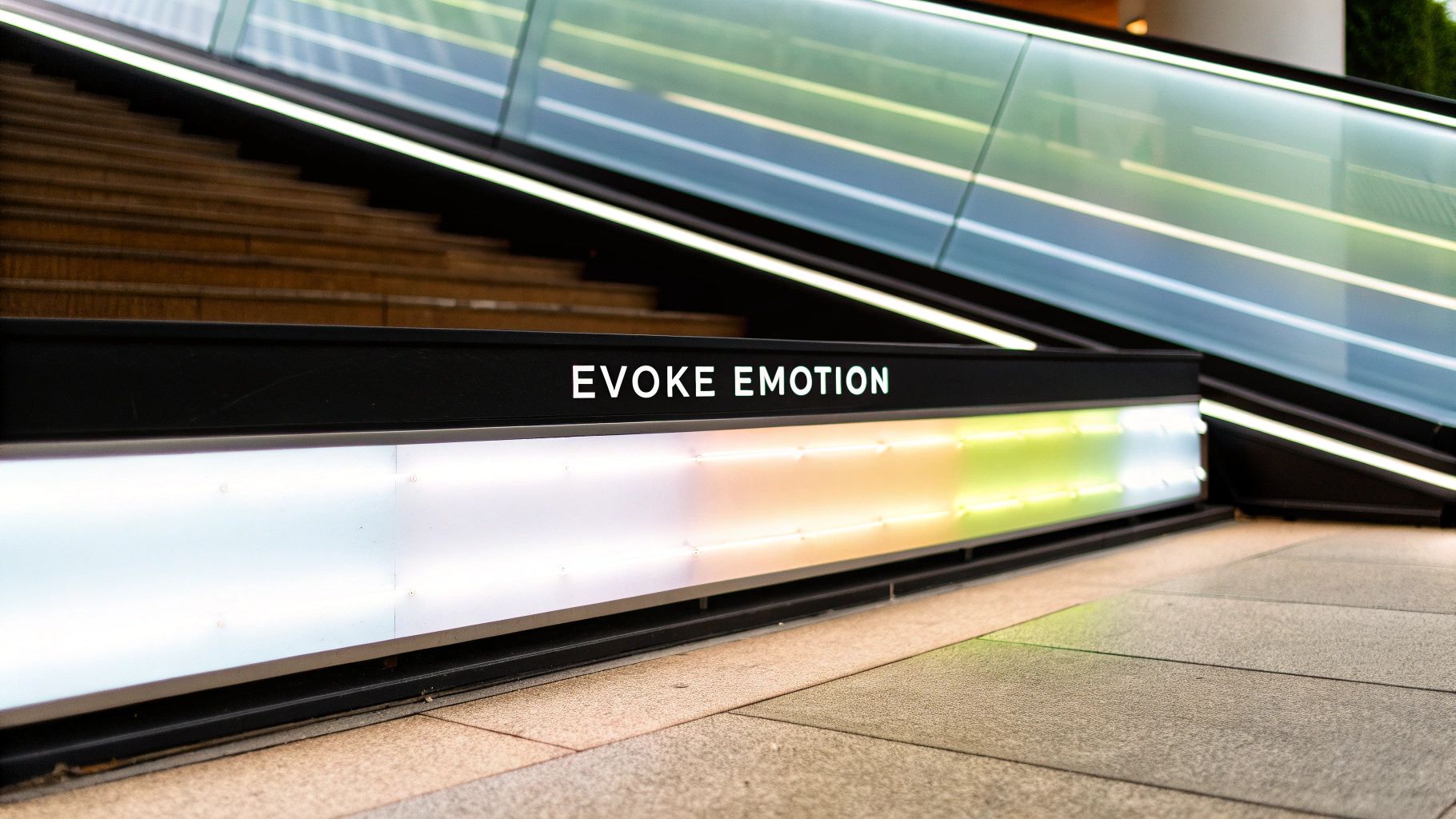
4. Gradient and Color Psychology
Harnessing the power of color is fundamental to design, but gradients take it a step further. This approach involves blending two or more colors to create a smooth transition, adding depth, dimension, and a modern feel to a banner. More than just a visual trend, the use of gradients and strategic color choices is deeply rooted in color psychology, allowing you to influence a viewer's emotions and guide their actions. This makes it one of the most dynamic banner design ideas for creating visually engaging and emotionally resonant content.
This technique was popularized by major brands like Instagram with its iconic 2016 logo rebrand and is a staple in Spotify's mood-based playlist covers. The appeal lies in its ability to feel both organic and futuristic. A well-executed gradient can mimic a natural sunset, conveying warmth and calm, or it can use vibrant, contrasting colors to evoke energy and excitement. By carefully selecting colors that align with your message, you can create a powerful subconscious connection with your audience, making your banner not just seen, but felt.
When to Use This Approach
This style is perfect for brands that want to appear innovative, vibrant, and emotionally intelligent. It’s highly effective for promoting digital products, announcing creative events like a webinar or workshop, or for any campaign aiming to elicit a specific mood. For educators, a soft blue-to-green gradient can create a calming banner for study materials, while a creator might use a bright pink-to-orange gradient to announce an exciting new video series. If your goal is to grab attention and stand out in a crowded digital feed, this is your go-to strategy.
Actionable Implementation Tips
A successful gradient is balanced and purposeful. Focus on smooth transitions and meaningful color combinations to avoid a chaotic design.
- Align Colors with Your Message: Use color theory to your advantage. Blue often conveys trust and professionalism, while yellow can evoke optimism and creativity. Choose colors that reinforce the core emotion of your banner's message.
- Limit Your Color Palette: Stick to two or three harmonizing colors for your gradient. Too many colors can overwhelm the viewer and make your design look cluttered and unprofessional.
- Use Gradients to Guide the Eye: Angle your gradient to draw attention toward your main focal point, such as the call-to-action button or a key piece of information. For example, a light-to-dark transition can lead the eye naturally down the banner.
- Ensure Accessibility: Test your color combinations for contrast and readability, especially for any text placed over the gradient. Tools like the WCAG Contrast Checker can help ensure your design is accessible to all users, including those with visual impairments.
5. Geometric Shapes and Patterns
Incorporating geometric shapes and patterns into your banner design ideas introduces a sense of structure, rhythm, and modernity. This approach leverages the clean lines, symmetry, and visual harmony of shapes like triangles, circles, and hexagons to create compositions that are both aesthetically pleasing and highly organized. By using these fundamental building blocks of design, you can construct a visual hierarchy that guides the viewer's eye and adds a layer of sophistication and intentionality to your message.
This design style, with roots in the Bauhaus movement and heavily influenced by the Swiss Style, uses mathematical precision to create a professional and contemporary feel. Think of how Microsoft's Fluent Design System uses grid-based shapes or how Mastercard's iconic logo uses two simple overlapping circles to build a globally recognized brand identity. The use of geometric frameworks allows for complex information to be presented in a structured, digestible format. These patterns can serve as a subtle background texture or as a dominant visual element that defines the entire layout.
When to Use This Approach
Geometric designs are exceptionally versatile. They are perfect for tech companies, financial institutions, and educational organizations that want to project an image of stability, logic, and innovation. This style works well for announcing conferences, promoting STEM-related courses, or creating branded materials for a modern, forward-thinking entity. If your goal is to convey precision, order, and a contemporary aesthetic, this is a winning strategy.
Actionable Implementation Tips
Success with geometric designs hinges on balance and purpose. Each shape and line should contribute to the overall composition without creating chaos.
- Create Visual Hierarchy: Use larger or more brightly colored shapes to draw attention to key elements like your call to action (CTA) or headline. Smaller, less saturated shapes can form a supporting background pattern.
- Maintain Consistent Spacing: Use a grid system to ensure the spacing between your geometric elements is uniform. This mathematical precision reinforces the sense of order and professionalism.
- Align Shapes with Brand Values: The shapes you choose can carry meaning. Circles can feel inclusive and friendly, squares can convey stability, and triangles can suggest direction and momentum. Select shapes that reflect your brand’s personality.
- Use Color Strategically: Apply color within your geometric elements to create contrast and guide the eye. A monochromatic color scheme can feel sophisticated, while a palette of bold, contrasting colors can create a dynamic and energetic mood.
- Ensure Readability First: Be careful that your geometric patterns do not overwhelm the text. Use transparency, muted colors, or strategic placement to ensure the background adds interest without sacrificing the legibility of your message.
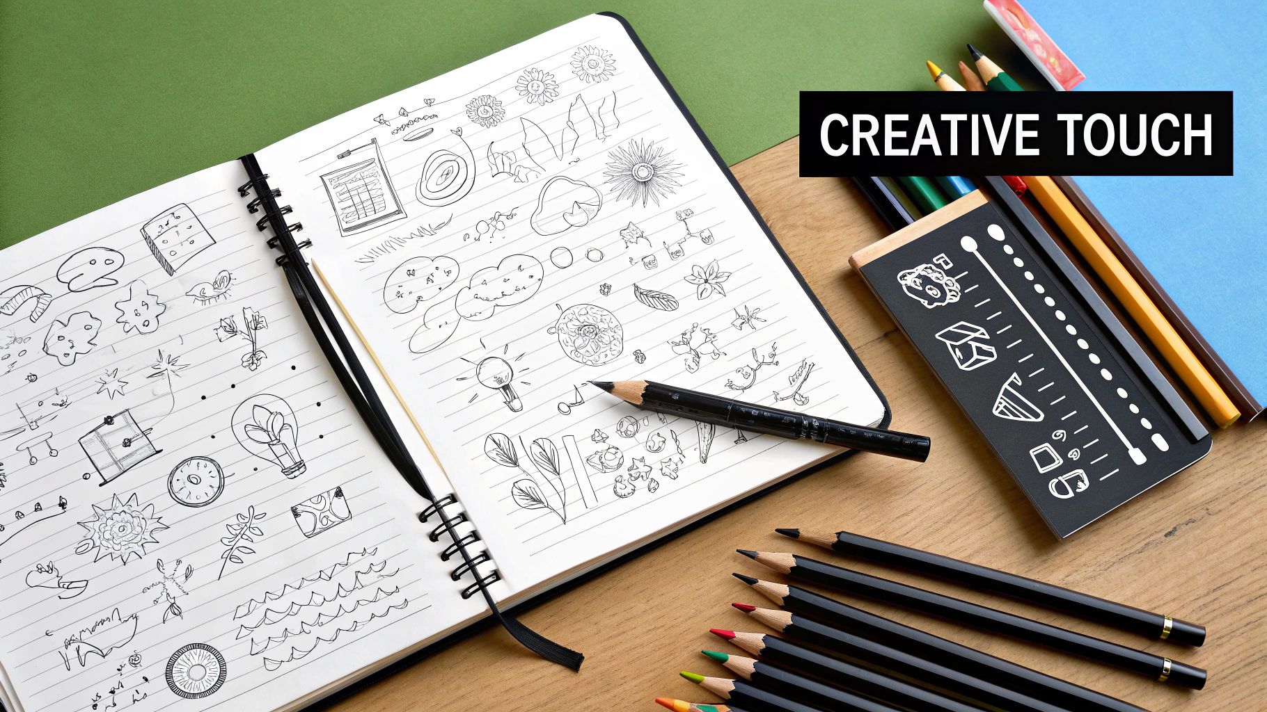
6. Hand-Drawn and Illustrated Elements
Injecting personality and warmth into digital spaces can be a challenge, but using hand-drawn and illustrated elements in your banner design is a powerful solution. This approach trades sleek, corporate perfection for a more human and approachable feel. By incorporating custom illustrations, doodles, and artistic graphics, you create a unique visual identity that feels personal and crafted, helping your message stand out in a sea of generic stock imagery. It's one of the best banner design ideas for brands wanting to appear creative, friendly, and authentic.
This trend was heavily popularized by tech startups like Mailchimp and Slack, who used quirky illustrations to demystify their products and build a friendly brand persona. Instead of a standard product screenshot, an illustration can tell a story, explain a complex concept, or simply add a touch of delight. The goal is to build an emotional connection with the viewer. The custom nature of these graphics ensures your banner is distinctive and memorable, as the visual style itself becomes a recognizable part of your brand.
When to Use This Approach
This style is perfect for brands, educators, or creators who want to communicate a friendly, innovative, or creative personality. It works exceptionally well for SaaS companies explaining features, educational platforms making learning fun, or non-profits telling a compelling human story. If your goal is to appear approachable and build a strong, memorable brand character that feels less corporate and more like a trusted friend, this is an excellent strategy.
Actionable Implementation Tips
A successful illustrated banner relies on consistency and purpose. The artwork should support the message, not distract from it.
- Develop a Consistent Style: Define a clear illustration style guide. Decide on your color palette, line weight, character design, and overall mood. This ensures all your banners feel cohesive and part of the same visual family.
- Use Illustrations to Simplify: Turn complex ideas into simple, engaging visuals. An illustrated workflow or a character representing your user can make abstract concepts instantly understandable and relatable.
- Align with Brand Tone: Ensure the illustration's personality matches your brand's voice. A playful, whimsical style might be great for a creative tool but could feel out of place for a financial institution.
- Consider Cultural Sensitivity: If you use illustrated characters, be mindful of representation. Strive for inclusive and thoughtful designs that resonate positively with a diverse audience and avoid reinforcing stereotypes.
7. Data Visualization and Infographic Style
Transforming complex information into compelling visuals is the core of the data visualization and infographic style. This approach leverages charts, graphs, and icons to present statistics and complex data in an easily digestible and engaging format. Instead of just stating a fact, this design proves it visually, building credibility and capturing attention in a way that plain text cannot. It's a powerful strategy for communicating value and authority, making it one of the most persuasive banner design ideas for data-driven narratives.
This design philosophy, rooted in the information design principles of pioneers like Edward Tufte and fueled by the rise of content marketing, turns your banner into a mini-report. The visual elements do the heavy lifting, making abstract numbers tangible and memorable. Think of HubSpot banners showcasing marketing trends with vibrant pie charts or a SaaS company like Salesforce demonstrating ROI with a clear, ascending bar graph. The design doesn't just present information; it tells a story with data, making the viewer feel informed and confident in the message.
When to Use This Approach
This style is exceptionally effective for B2B marketing, educational content, financial services, and any campaign where a key performance indicator (KPI) is the main selling point. Use it to promote case studies, annual reports, or research findings. If your goal is to establish thought leadership, demonstrate tangible results, or make a complex topic accessible to a wider audience, this data-centric approach is ideal.
Actionable Implementation Tips
To succeed with this style, your design must prioritize clarity and impact. The goal is to inform, not overwhelm.
- Highlight One Key Statistic: Don't crowd the banner with multiple charts. Pick the single most impressive or surprising data point and make it the hero of your design. For example, "93% of Users Report Increased Productivity."
- Use Strategic Color-Coding: Assign specific colors to different data categories to help viewers process information quickly. Ensure these colors are high-contrast and align with your brand palette for a cohesive look.
- Keep It Clean and Simple: Choose simple, universally understood chart types like bar graphs, line charts, or pie charts. Avoid overly complex or 3D visuals that can distract from the data itself.
- Cite Your Source: Briefly mention the source of your data (e.g., "Source: 2024 Industry Report") to build trust and credibility. A small, legible line of text is sufficient.
7 Banner Design Ideas Comparison
| Style | Implementation Complexity ? | Resource Requirements ? | Expected Outcomes ? | Ideal Use Cases ? | Key Advantages ⭐ |
|---|---|---|---|---|---|
| Minimalist Design with Bold Typography | Low - Simple layout and typography | Low - Basic design tools and fonts | Clear, immediate message comprehension | Brand awareness, product launches, simple messages | High readability, fast loading, timeless look |
| Photo-Centric Visual Storytelling | Medium - Quality photography and composition | Medium to High - Professional photos | Emotional connection, strong engagement | Lifestyle marketing, storytelling, social media | Evokes emotion, shareable, real-world context |
| Animated and Interactive Elements | High - Requires animation and interactivity | High - Development and testing | Higher engagement and memorability | Interactive campaigns, product demos, promotions | Increased clicks, dynamic storytelling |
| Gradient and Color Psychology | Medium - Color blending and design finesse | Medium - Design skills and tools | Modern aesthetic, emotional impact | Trendy brands, digital-first campaigns | Visual depth, emotional influence, flexibility |
| Geometric Shapes and Patterns | Medium - Precise layout and structure | Medium - Design tools | Professional, modern, structured appearance | Corporate branding, tech, professional services | Versatile, scalable, clean and professional |
| Hand-Drawn and Illustrated Elements | High - Custom artwork and illustration | High - Illustrators and time investment | Unique, personal brand differentiation | Creative brands, authenticity-focused campaigns | Distinctive style, personalization, approachability |
| Data Visualization and Infographic Style | Medium to High - Data accuracy and design | Medium - Data sources and visualization | Simplified complex info, builds credibility | B2B marketing, educational content, performance tracking | Demonstrates ROI, educates, appeals to logic |
From Idea to Impact: Putting Your Banner Design into Action
We’ve journeyed through a landscape rich with diverse and actionable banner design ideas, from the clean authority of minimalist typography to the engaging world of animated elements. The power of these concepts lies not in their isolated application, but in their thoughtful combination and adaptation to your unique goals. You now have a strategic toolkit, a collection of seven distinct visual languages, each capable of conveying a specific tone and capturing a particular audience’s attention.
The core lesson is this: effective banner design is a bridge. It connects your message to your audience in the most direct and impactful way possible. Whether you are a student creating a presentation header, an educator designing a course banner, or a content creator aiming to stop the scroll, the principles remain constant. The goal is to move beyond mere decoration and embrace strategic communication.
Key Takeaways for Immediate Application
To truly master these techniques, you must shift from passive learning to active creation. As you move forward, keep these central pillars of effective design in mind:
- Clarity is King: Your banner must communicate its core message in seconds. This was the driving force behind minimalist designs and data-driven infographic styles. Always prioritize legibility and a clear visual hierarchy.
- Emotion Drives Engagement: Concepts like photo-centric storytelling, hand-drawn illustrations, and the strategic use of color gradients are powerful because they tap into human emotion. A banner that makes someone feel something is a banner that will be remembered.
- Context Defines Success: The "best" design does not exist in a vacuum. A bold, geometric pattern might be perfect for a tech blog, while a soft, illustrated banner is better suited for a creative writing workshop. Always consider your platform, your audience’s expectations, and your overarching brand identity.
Your Next Steps: From Concept to Creation
The journey from a great idea to a polished final product can seem daunting, but it’s a process of iteration and experimentation. Start small. Pick one of the banner design ideas from this article that resonates with you and your current project. Don't strive for perfection on your first attempt; aim for progress.
Challenge yourself to create three different versions of the same banner, each using a different approach. One might use bold typography, another a compelling background photo, and a third a vibrant gradient. This simple exercise will do more for your skills than hours of theoretical study. It forces you to see how different design choices fundamentally alter the message and impact of your content. This hands-on practice is where true understanding is forged, transforming abstract concepts into tangible, effective visual communication skills.
Ultimately, the most compelling banner designs are born from a fusion of inspiration and execution. They begin with a spark, one of the many banner design ideas we've discussed, but they come to life through thoughtful application and the right set of tools. The concepts in this guide provide the map; your creativity and willingness to experiment will navigate the path to creating visuals that not only look good but also achieve their purpose with precision and flair.
Ready to turn your notes and ideas into stunning visual banners instantly? TNote features a powerful 'md2card' function that transforms your Markdown text into professionally designed, shareable cards, making it effortless to test which design best communicates your message. Streamline your creative process and bring your banner design ideas to life with a single click.