Why Your Bake Sale Poster Makes or Breaks Attendance
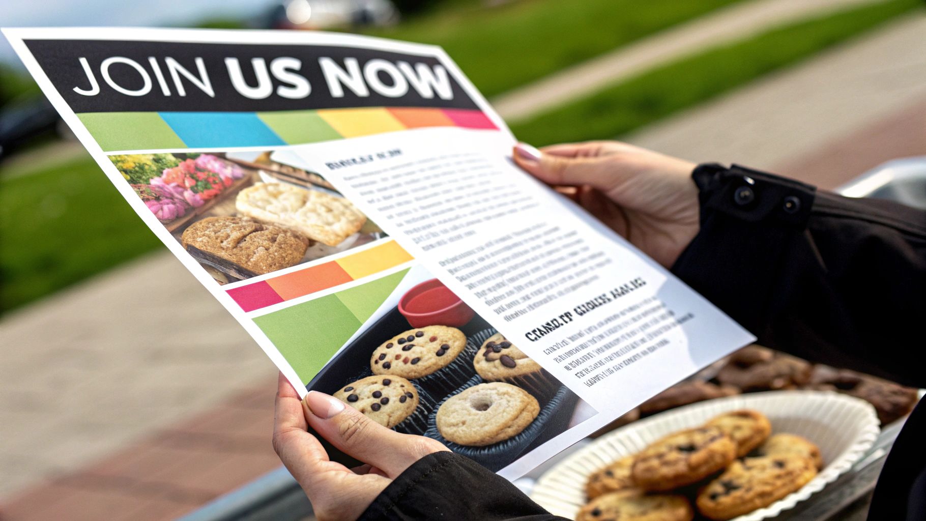
Let's get real for a moment: long before anyone gets a whiff of your amazing brownies, your bake sale poster is out there doing all the hard work. It's your most dedicated salesperson, running 24/7 on community bulletin boards and social media. A rushed, messy poster can signal a disorganized event, but a thoughtfully designed one screams quality, excitement, and community spirit, making people feel like they absolutely have to stop by.
I've talked to enough seasoned fundraising coordinators to see a clear trend: a great poster can literally double event attendance compared to a basic flyer. This isn't just about slapping on a date and time; it's about crafting a message that builds genuine excitement.
The Psychology of a Great Poster
A truly effective poster does more than just inform; it sparks an emotional connection. It uses specific visual hints to tell people this isn't just any old bake sale—it's an event, a gathering, something special. Think of your poster as the movie trailer for your fundraiser. If the trailer looks good, people will line up for the main feature.
Communicates Quality: A professional, polished design sends a subconscious message that the baked goods will be top-notch, too.
Creates Urgency: When you combine clear, bold information with delicious-looking pictures, the event feels like a can't-miss opportunity.
Builds Community Spirit: The right colors, fonts, and imagery can make the event feel warm, welcoming, and all for a good cause that everyone wants to support.
More Than Just a Fundraiser
Believe it or not, bake sale posters have a rich history of being more than just ads for cake; they’ve been a platform for making a statement. One famous example from the 1960s used the slogan, "It will be a great day when our schools get all the money they need and the Air Force has to hold a bake sale to buy a bomber."
This just goes to show how a simple poster for a local event can tap into bigger ideas and connect with people on a deeper level. You can read more about the political context of this iconic poster, which is archived by the Library of Congress. Your poster has the same potential to be memorable and make a real impact.
Getting Clear On Your Message Before Touching Design Tools

It doesn’t matter how beautiful your bake sale poster is if the message is a mess. Before you even dream of opening a design tool, the most successful organizers I've seen take a solid 30 minutes to nail down their core message. This little bit of planning upfront saves hours of frustrating redesigns and makes sure every visual element serves a purpose.
This idea of purpose-driven fundraising isn’t new. Bake sales have been around since the 1800s, acting as a powerful way for communities to support important causes. For instance, suffragettes in the early 20th century famously used bake sales to fund their fight for the right to vote, tying something as simple as a cookie to a powerful mission. You can actually read more about this history, which highlights the long-standing tradition of bake sales as charitable tools.
Defining Your Poster’s Foundation
Your poster's message really comes down to answering a few key questions. Getting this right is what turns your design from a random collection of pretty pictures into something that genuinely gets people to show up.
Who are you trying to reach? Think about your ideal attendee. Are you targeting busy parents at a school event, cash-strapped college students, or the general public at a farmer's market? A poster aimed at students might rock some humor and bold, bright colors, whereas one for a quiet neighborhood event could feel cozier and more traditional.
What's the one thing they absolutely must remember? If they only glance at your poster for three seconds, what's the single most important detail? Is it the date, the location, or the amazing cause you're supporting? Whatever it is, that becomes your visual centerpiece.
Where will people see this poster? The context is everything. A poster designed for a chaotic, cluttered hallway bulletin board needs to be much bolder and simpler than one that will appear on a clean, minimalist social media feed.
Designing a Layout That Guides the Eye Where You Want It

A great bake sale poster isn’t just a random collection of text and images; it's a visual roadmap. It should guide a person’s eyes from the most important info to the smaller details in a way that feels natural and effortless. The key to this is visual hierarchy—a design term for arranging elements to show their order of importance. Without it, you get a chaotic jumble that makes people tune out instead of lining up for cookies.
Think of your poster's information like a pyramid. Your headline is the peak—the biggest and boldest text on the page. The middle section contains the crucial details like the date, time, and location. Finally, the base holds the supporting info, like the cause you're fundraising for or a tempting list of treats. This structure creates a clear path for the reader's eye to follow.
To help you map out your poster's layout, it's useful to prioritize what information gets the most attention. This table breaks down the essential elements and offers suggestions for sizing and placement.
Information Element | Priority Level | Recommended Size | Ideal Placement |
|---|---|---|---|
Headline (e.g., "Bake Sale!") | High | Largest text on the poster | Top third of the poster |
Date, Time & Location | High | Second-largest text | Center or upper-middle section |
Key Image or Graphic | High | Prominent, often the focal point | Center or integrated with the headline |
Reason for Fundraiser | Medium | Medium-sized text | Below the main details |
List of Treats/Items | Medium | Medium-sized, easy-to-read font | Side or bottom section |
Contact Info/Social Media | Low | Smallest text | Bottom corner or footer |
Ultimately, this hierarchy ensures that even someone glancing at your poster from across the room will catch the most critical information—what it is and when it's happening. The smaller details are there for those who get closer and want to know more.
Using Grids And Whitespace
You don’t have to be a professional designer to achieve a clean, organized layout. One of the easiest tricks is to work with an invisible grid. Imagine your poster is divided into columns and rows, and align your text and images along these lines. This simple act of alignment instantly brings a sense of order and polish. For instance, a student group at the University of Lincoln created effective posters for their events, including a bake sale that raised over £200, by organizing their information clearly within a grid structure.
Whitespace—the empty area around your design elements—is just as important as the elements themselves. It's not wasted space; it’s what allows your headline, images, and key details to breathe and stand out. A cluttered poster feels overwhelming and hard to read, while a design with plenty of whitespace looks confident and is much easier to digest, especially from a distance.
The Power Of A Focal Point
Every effective poster needs one dominant focal point. This is the star of your show. It could be a mouth-watering photo of a frosted cupcake or your catchy, oversized headline. Everything else on the poster should act as a supporting character, guiding attention toward this main element rather than competing with it.
A common mistake is trying to make everything big and bold, which just creates visual noise and confuses the viewer. Instead, choose your star player and let the other elements play their supporting roles. This one principle will make your bake sale poster far more engaging and successful.
Choosing Colors And Typography That Build Trust
Your font and color choices do more than just make your bake sale poster look pretty—they're powerful psychological cues that can build trust or create doubt. The right combination can make your fundraiser feel professional and inviting, while the wrong one can accidentally signal that the event is amateur or disorganized. It’s all about creating the right vibe.
Speaking With Color
Color is the first thing people notice, and it sets the emotional tone. For a bake sale, you generally want colors that feel warm, delicious, and community-oriented. Think about the feeling you want to evoke.
Warm & Inviting: Palettes with creamy yellows, soft oranges, and chocolatey browns instantly connect to baking and feel welcoming. These colors are associated with happiness and comfort.
Fresh & Wholesome: For a sale focused on healthier options or a spring event, light greens, sky blues, and rosy pinks can signal freshness and natural ingredients.
Bold & Urgent: If your fundraiser is for a high-energy cause like a sports team, using bright, contrasting colors like a bold red against a clean white can create excitement and a sense of urgency.
I'd recommend staying away from muddy, dark colors that can feel gloomy or overly aggressive neons that might seem unprofessional. Your goal is to make people feel good about supporting your cause.
Fonts That Feel Trustworthy
Typography is the voice of your poster. The fonts you choose should be clear, readable, and match the personality of your event. A key rule I always stick to is to limit yourself to two or three fonts at most. Any more than that, and your design will look cluttered and chaotic.
For your headline, a friendly, slightly bold sans-serif font (like Montserrat or Poppins) works wonders. It’s clean, modern, and easy to read from a distance. For the body text with details like date and time, stick to a simple, clean font that is legible even when smaller. Avoid overly decorative or script fonts for critical information, as they can be difficult to decipher quickly on a busy bulletin board. The goal isn't just to be stylish; it's to be instantly understood.
Using Images That Enhance Rather Than Overwhelm
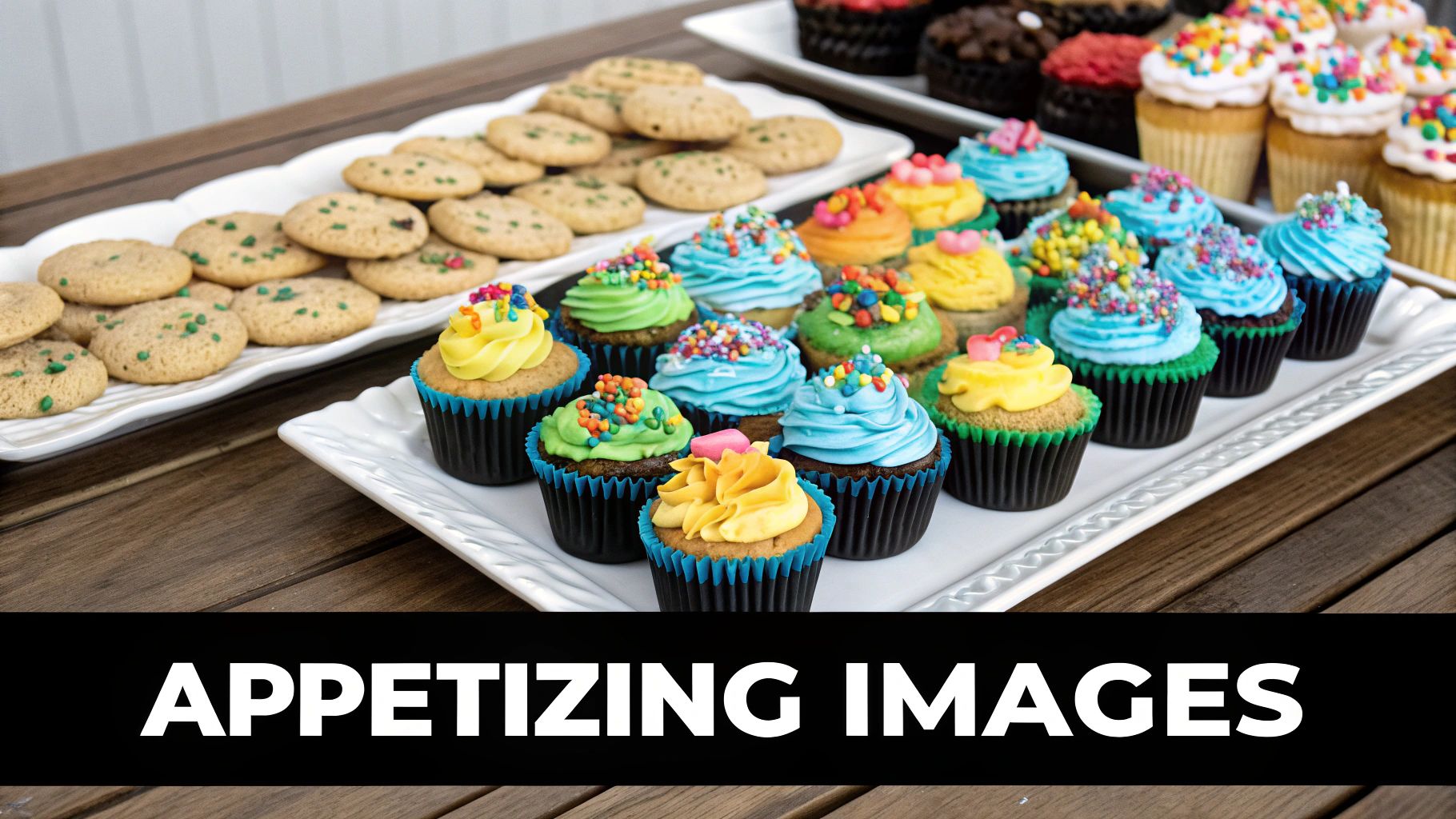
The perfect image can make people crave your cookies before they even smell them baking. But the wrong image? It can create a visual mess that completely buries your message. The idea is to find strategic imagery—visuals that actively sell the event—not just decorative fluff that fills up empty space. A high-quality photo of a gooey, freshly baked chocolate chip cookie isn't just a picture; it's a direct invitation.
A fantastic image works with your text, making the entire poster more compelling. It’s been shown that content with relevant images gets a staggering 94% more views than content without. This isn't just true for online articles; it applies just as much to a poster tacked onto a community bulletin board. Your image should be the delicious hook that reels people in to read all the details.
Photos vs. Illustrations
Deciding between a photo and an illustration really comes down to the feeling you want your bake sale to have.
Photos: These are your go-to for making your treats look absolutely irresistible. A bright, high-resolution photo of your prize-winning brownie or a perfectly swirled cupcake creates an instant, tangible craving. If your main goal is to make mouths water, a photo is your best bet.
Illustrations: These are brilliant for setting a specific mood. A charming, whimsical drawing can make your event feel more kid-friendly, community-oriented, or just plain unique. Illustrations are also a great way to stand out if the bulletin board is already covered in photo-based posters.
Sourcing High-Quality, Legal Images
You don't need to be a professional photographer to find incredible visuals for your poster. There are amazing online resources that offer free, high-quality images you can use without any legal worries.
Here's what a quick search for "bake sale" on a royalty-free site looks like:
Using platforms like Unsplash or Pexels opens up a huge library of professional-grade photos. You can use them on your bake sale poster without having to worry about copyright issues, giving your poster a polished look for free.
Choosing Design Tools That Match Your Skills And Budget
You don’t need a pricey software subscription to create a fantastic bake sale poster. The best tool is simply the one that fits your current skills and budget, whether that's a free online platform or a professional-grade program. The main goal is to get your message out clearly and beautifully without a huge technical headache.
The Free and Friendly Approach
For most people organizing a fundraiser, free tools are more than enough to get the job done. I've seen countless successful bake sales promoted with posters made using free, intuitive platforms. A great example is a student team at the University of Lincoln that I followed; they created posters for a bake sale that raised over £200 for charity—all without spending a dime on design software. This just proves you don't need a big budget to get great results.
Platforms like Canva are built for non-designers, offering thousands of event poster templates you can customize in minutes. Their real strength is simplicity:
Drag-and-drop editing: You can easily add your text, photos of your delicious baked goods, and brand colors without any technical skills.
Massive template library: Instead of starting from a blank page, you can find a starting point that already looks great and just swap in your details.
Built-in assets: These tools offer a treasure trove of free stock photos, icons, and fonts right at your fingertips.
Before you commit to a tool, it's worth comparing a few of the most popular options to see which one feels right for you. Here’s a quick breakdown to help you decide.
Tool Name | Skill Level | Cost | Template Quality | Export Options | Best For |
|---|---|---|---|---|---|
Canva | Beginner | Free (Pro plan available) | Excellent | PDF, JPG, PNG | Beginners needing high-quality templates and a simple interface. |
Adobe Express | Beginner | Free (Premium plan available) | Very Good | PDF, JPG, PNG | Users who might want to integrate with other Adobe products. |
Visme | Beginner-Intermediate | Free (Paid plans with more features) | Good | PDF, JPG, PNG, Interactive | Creating more than just posters, like presentations or infographics. |
Adobe Photoshop | Advanced | Subscription-based | N/A (Build from scratch) | All professional formats | Designers needing total creative control and advanced features. |
Adobe Illustrator | Advanced | Subscription-based | N/A (Build from scratch) | All professional formats | Creating custom vector graphics and illustrations for posters. |
As you can see, the free tools offer plenty of power and are perfectly suited for a bake sale poster. They provide everything you need to create a professional-looking design without the cost or complexity of advanced software.
When to Consider Advanced Tools
What about programs like Adobe Photoshop or Illustrator? Honestly, they are overkill for a one-off bake sale poster unless you already have some design experience. These tools offer limitless control but come with a steep learning curve and a monthly subscription fee.
An advanced tool is only worth considering if you're already comfortable using it or plan to create a lot of custom marketing materials down the road and feel limited by template-based options. For everyone else, sticking with a user-friendly, free alternative is the smarter, faster choice.
Getting Your Poster Seen By The Right People

A fantastic bake sale poster is only half the battle. If no one sees it, all that creative effort goes to waste. Getting eyeballs on your design is what turns a pretty picture into a crowd of hungry customers. This means thinking strategically about where your poster will live—whether it’s a physical flyer or a digital post. Each requires a different approach to avoid common pitfalls like blurry prints or pixelated social media shares.
Prepping Your Files for Print and Screen
Before you rush to share your masterpiece, you need to save it in the right format. The file you send to a print shop is completely different from the one you’ll upload to Instagram. Getting this right is crucial for a professional look.
For Printing: Always export your file as a PDF (Print). There's a reason it's the industry standard—it locks in your fonts, images, and layout perfectly. The most important setting here is the resolution, which should be 300 DPI (dots per inch). This high resolution is the secret to a sharp, professional-looking print without any fuzzy edges.
For Digital Sharing: When posting online, a JPG or PNG is your best bet. These formats are optimized for screens, meaning they load quickly and look great on phones and computers. A resolution of 72 DPI is perfect for digital use. Creating a separate, web-friendly version ensures your poster looks crisp without making your friends wait for a huge file to download.
Smarter Distribution Strategies
Pinning one poster to a community board is a good start, but a multi-pronged attack will get you much better results. A student group at the University of Lincoln nailed this by combining physical posters with a targeted social media campaign for their bake sale. The result? They raised over £200 for charity because they met their audience where they were.
Here are a few tactics to get your poster seen by as many people as possible:
Physical Placement: Think beyond the usual spots. Where do your ideal customers hang out? Local coffee shops, library bulletin boards, laundromats, and community centers are often overlooked goldmines for high-traffic placement.
Digital Sharing: Put together a digital "poster pack." Send your optimized JPG to local Facebook groups, school newsletters, and neighborhood apps like Nextdoor. Ask your friends, family, and team members to share it on their own social media feeds. This simple action creates a ripple effect, extending your reach far beyond your personal network.
The winning formula is a great bake sale poster paired with a smart plan to get it in front of the right people. This one-two punch is what will make your event a delicious success.
Tired of your awesome notes and ideas getting lost in boring documents? With Tnote, you can instantly turn your Markdown text into stunning, shareable knowledge cards. Perfect for making your content pop on social media or in presentations. Give your ideas the visual impact they deserve. Check out Tnote and see the magic for yourself.